How to Audit Your Brand (and Know What to Fix)
If your branding feels a bit off, but you can’t quite put your finger on why, you’re not alone. Most business owners don’t wake up thinking, “I need a rebrand.” They think things like:
“Why does my Instagram feel messy?”
“My website looks fine… but not great?”
“I keep tweaking things but it never feels finished.”
That’s usually a sign you don’t need more design. You need clarity.
A brand audit helps you step back, look at your brand as a whole, and figure out what’s actually working, what isn’t, and what’s worth fixing first, without spiraling into a full rebrand or endless tweaks. In this post will walk you through how to audit your brand in a simple, realistic way, so you can move forward feeling more confident and less overwhelmed!
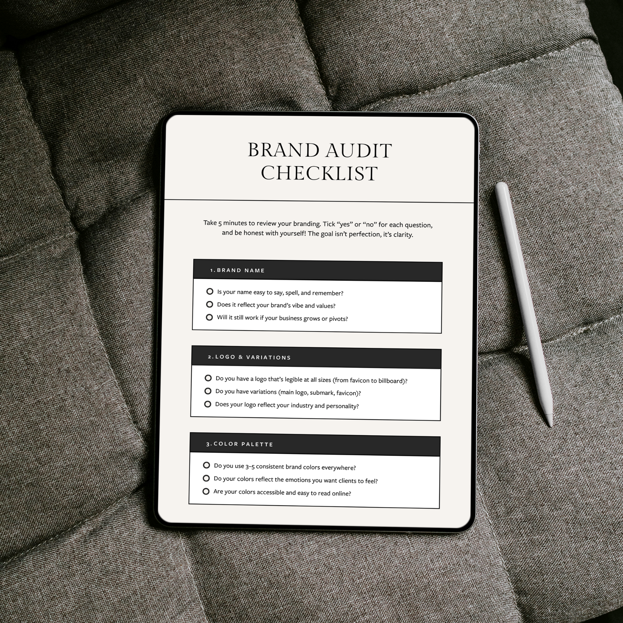
(Want to make this easier? I’ve created a free Brand Audit Checklist you can work through alongside this post to spot exactly what needs fixing.)
1. Brand name
Your brand name sets the tone before anyone sees a logo or color palette.
When you audit your name, ask:
Is it easy to say, spell, and remember?
Does it still reflect your brand’s vibe and values?
Will it still make sense if your business grows or pivots?
A name doesn’t need to explain everything you do, but it should feel right. If your business has evolved, it’s normal to outgrow a name that once felt perfect.
If you’re starting to question whether your name still fits, a structured naming process can help bring clarity. I’ve put together a Brand Naming Guide that walks you through how to evaluate your current name and explore new options that actually align with your brand’s direction.
2. Logo & variations
A professional brand isn’t built on one logo alone. You should be able to use your logo confidently everywhere, from a tiny favicon to a website header.
Check:
Is your logo legible at all sizes?
Do you have variations, like a main logo, submark, and favicon?
Does your logo reflect your industry and personality?
Even a well-designed logo can look unprofessional if it’s stretched, blurry, or used incorrectly.
If you’re unsure whether you have the right setup, this post might help: 👉 3 Logo Variations Every Brand Needs
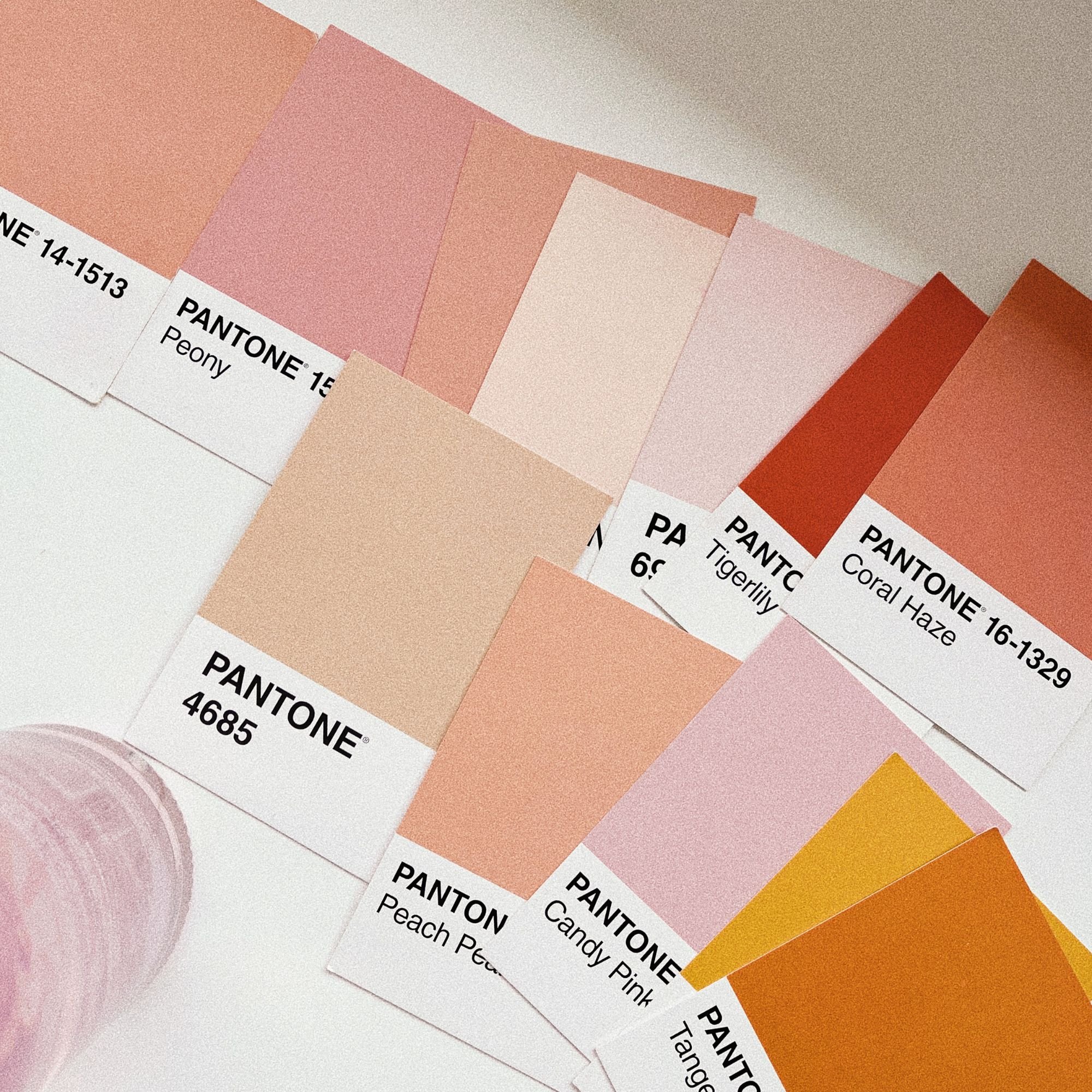
3. Color palette
Color is one of the quickest ways people judge a brand, often subconsciously.
During your audit, look at:
Are you using 3–5 core colors consistently?
Do your colors reflect the emotions you want clients to feel?
Are they easy to read and accessible online?
If your brand feels messy, it’s often because too many colors are being used inconsistently. A limited palette, used well, almost always looks more professional than a large palette used randomly.
If you’re feeling unsure about your color palette, I’ve put together 10 bold color palettes and 7 feminine color palettes to help spark ideas and show how intentional color choices can completely change the feel of a brand.
4. Fonts and typography
Typography plays a bigger role than most people realize.
Ask yourself:
Do you stick to 2–3 fonts total, a headline font, body font, and maybe one accent?
Do your fonts match your brand’s personality?
Are they consistent across printed documents, your website, and social media?
Professional branding is easy to read. If people have to squint, zoom in, or work too hard to read your content, the brand instantly feels less polished, even if it looks pretty.
5. Curated images
Imagery can make or break how professional a brand feels. You don’t need a photoshoot to have strong visuals, but you do need intention.
Check:
Do your images reflect your brand’s style and personality?
Do they feel consistent in tone, lighting, and mood?
Do they work together as a set?
Whether you’re using stock images or your own photos, consistency matters more than perfection. Random imagery is one of the fastest ways to make a brand feel unfinished.
6. Brand board or guidelines
This is one of the most overlooked pieces of branding. A brand board is simply a one-page overview of your logo, colors, and fonts. But it’s incredibly powerful.
Ask:
Do you have a clear reference for your brand visuals?
Could you hand it to a VA or designer and trust they’d stay consistent?
Do you use it when designing?
If you’re constantly second-guessing your choices, a lack of guidelines is usually why. A simple brand board removes decision fatigue and keeps everything aligned.
7. Social media and marketing assets
Look at your content as a whole, not post by post.
Audit things like:
Do your posts, stories, and pins look cohesive together?
Are you using templates instead of starting from scratch every time?
Would someone recognize your brand at a glance?
Professional brands don’t reinvent the wheel every week. They repeat visual choices intentionally, which saves time and builds familiarity.
8. Overall consistency and confidence
This is the final, and arguably most important, check.
Ask yourself:
Does your website branding match your socials?
Would someone recognize your brand without seeing your name?
Do you feel proud and confident showing up online?
Branding isn’t just about how others perceive you. It directly affects how confidently you run your business.
If your brand makes you hesitate, that’s a sign something needs refining.

Want to audit your own brand properly?
If reading through this has made you realize a few things feel “off,” you’re not alone. Auditing your brand in your head is helpful, but writing it down is where clarity really clicks.
I’ve created a free Brand Audit Checklist to help you work through each part of your brand step by step, without overwhelm or second-guessing. It’s designed to help you spot what’s actually worth fixing, and what can be left alone for now.
How to use your brand audit results
Once you’ve gone through these points, take a step back before changing anything. A brand audit isn’t about fixing everything at once. It’s about understanding what level of change you actually need.
For some brands, the audit highlights a few clear tweaks:
tightening up colors
improving logo usage
creating more consistency across platforms
In that case, small refinements can go a long way.
For others, the audit reveals something deeper:
the brand feels pieced together
there’s no clear visual direction
everything works individually, but not together
That’s often a sign it’s time for a more cohesive foundation, rather than more patchwork fixes!
Get the Free Brand Audit Checklist

Meet the Designer
Hey, I’m Joanna, a UK-based brand identity designer and founder of JK Creative Co. After 5+ years designing for startups, creatives, and purpose-led businesses, I’ve shifted my focus to making beautiful, strategic branding more accessible. Through my collection of premium brand kits, I help small business owners and entrepreneurs launch with confidence - no custom process or big agency budget required.
💡 Want to see how I can support your brand? Explore the kits →