How to Choose a Brand Aesthetic That Attracts the Right Clients
If you’ve ever opened Pinterest to look for branding inspiration and ended up more confused than when you started, you’re not alone!
One minute you’re saving soft neutral logos. Next it’s bold typography, earthy color palettes, romantic scripts, modern layouts. Everything looks good, but none of it feels clear. The problem isn’t that you have bad taste, it’s that you’re trying to choose a brand aesthetic without a strategy.
Here’s the truth. Effective branding isn’t about choosing what you personally love, it’s about choosing visuals that attract the right clients, while still feeling aligned with you.
This post will walk you through how to choose a brand aesthetic that feels intentional, confident, and magnetic to the people you actually want to work with!

Step 1: Start with who you want to attract
Before you think about colors, fonts, or logos, zoom out and focus on your ideal customer. Ask yourself:
Who are you trying to attract?
What stage of business or life are they in?
What do they value most, for example simplicity, luxury, creativity, or calm?
How do you want them to feel when they land on your website or Instagram?
A wellness brand aimed at burnt-out entrepreneurs will look very different to a bold creative studio targeting confident startups. Neither is better, but one will work far better for the right audience.
Your brand aesthetic should feel familiar and reassuring to your ideal client. It should make them think, “This is for me.”
If you want help getting clear on who you’re actually building for, my post How to Define Your Ideal Client So Your Brand Actually Connects breaks this down into simple, actionable steps.
Step 2: Define your mission and values
Your brand aesthetic should visually support what your business stands for, afterall, branding is all about telling your story. Take a moment to reflect on:
Why does your business exist? (beyond making money)
What change are you trying to create for your clients?
What values matter most to you as a brand?
For example, a brand built around slow living, sustainability, and intention usually feels grounded and calm. A brand built around confidence, disruption, or big ideas often leans bolder and more expressive.
When your visuals contradict your mission, clients feel it, even if they can’t explain why.
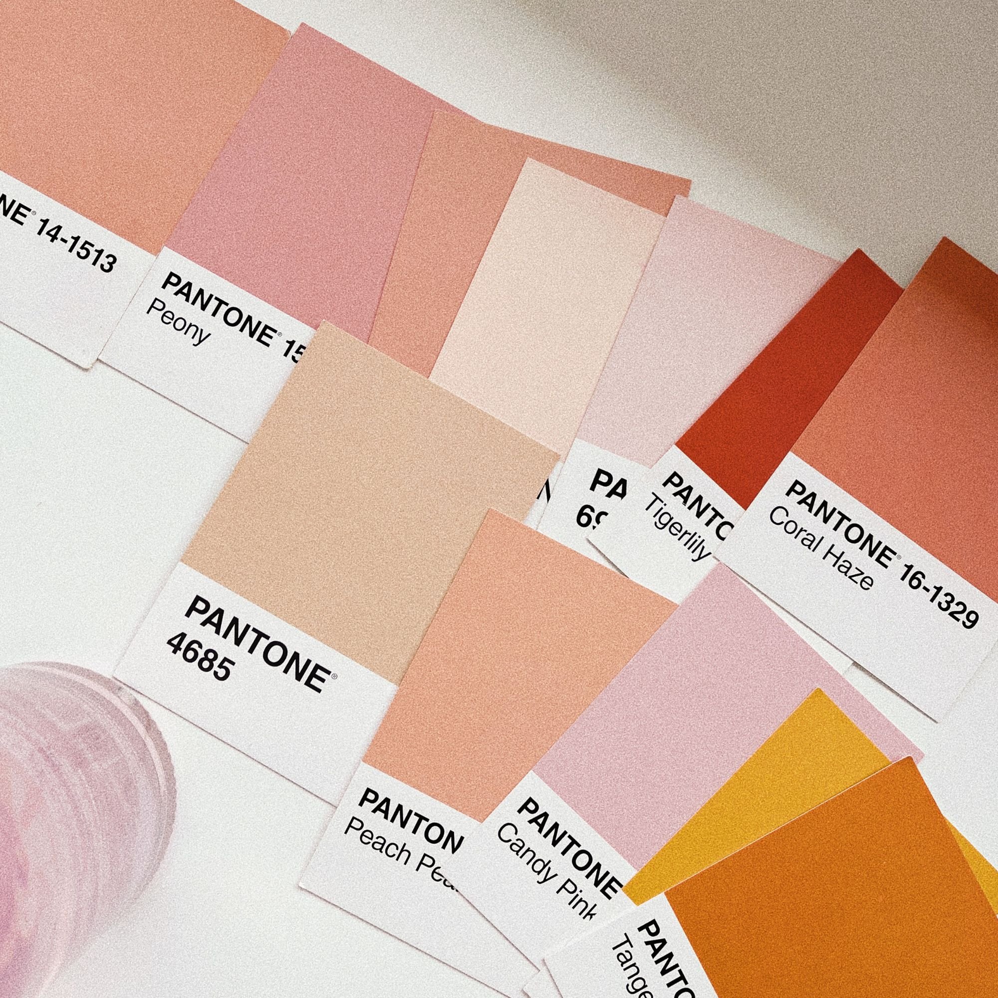
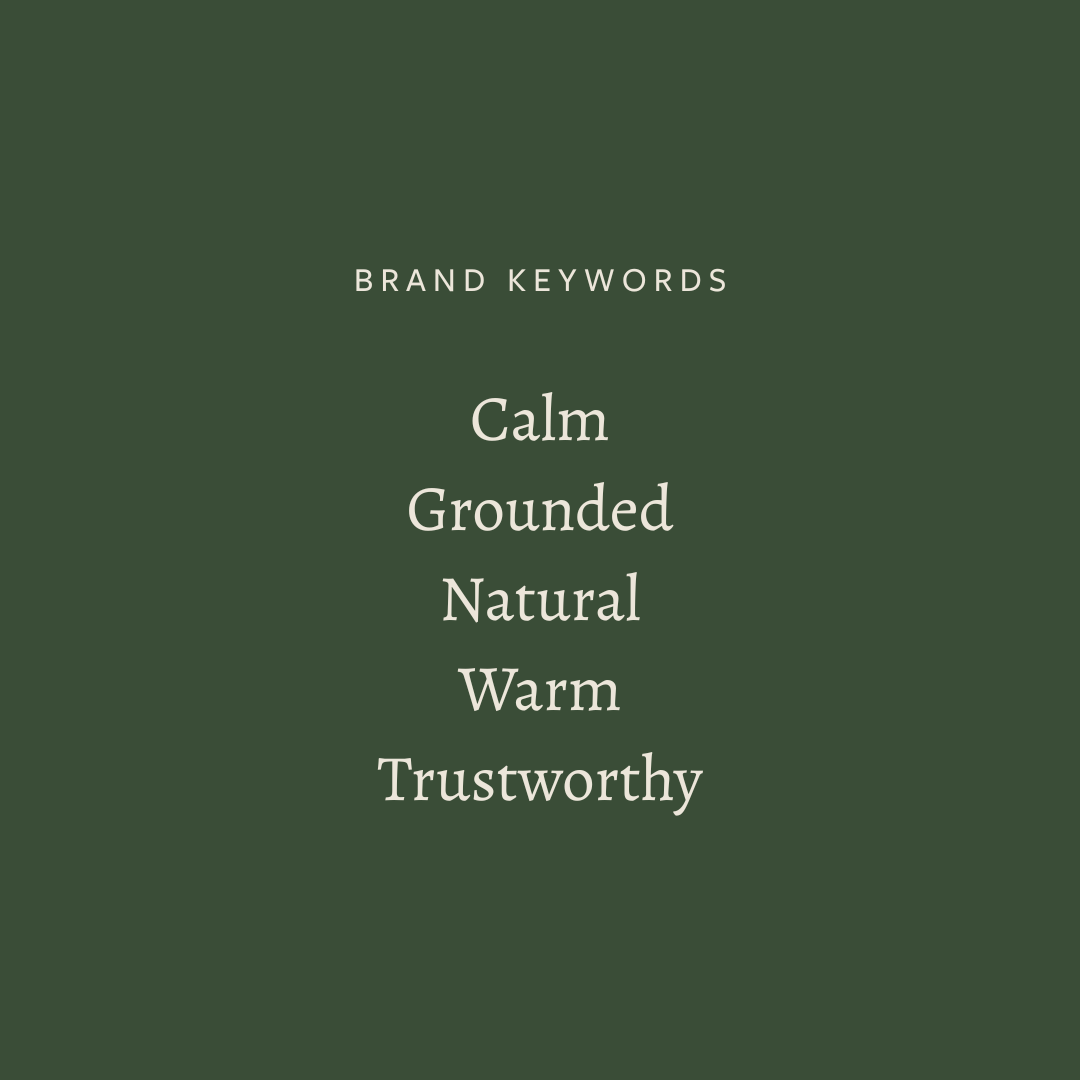
Step 3: Choose 5 brand keywords
This is one of the most powerful steps, and one most people skip. Choose five words that describe how your brand should feel. Not how it looks, but how it feels to experience.
Examples:
Calm, grounded, natural, warm, trustworthy
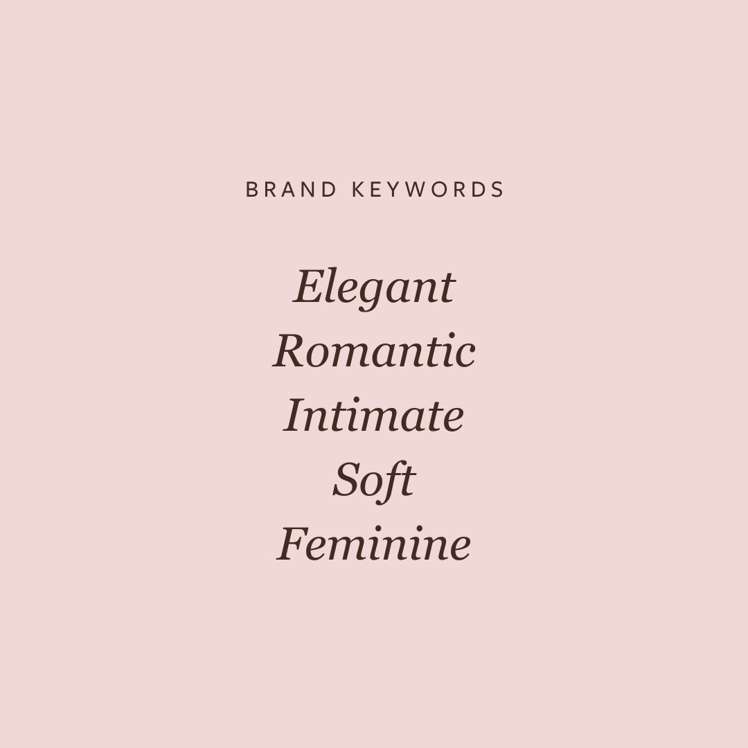
Elegant, romantic, intimate, soft, feminine
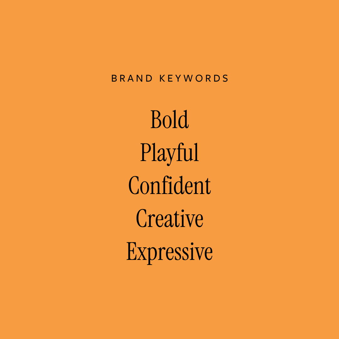
Bold, playful, confident, creative, expressive
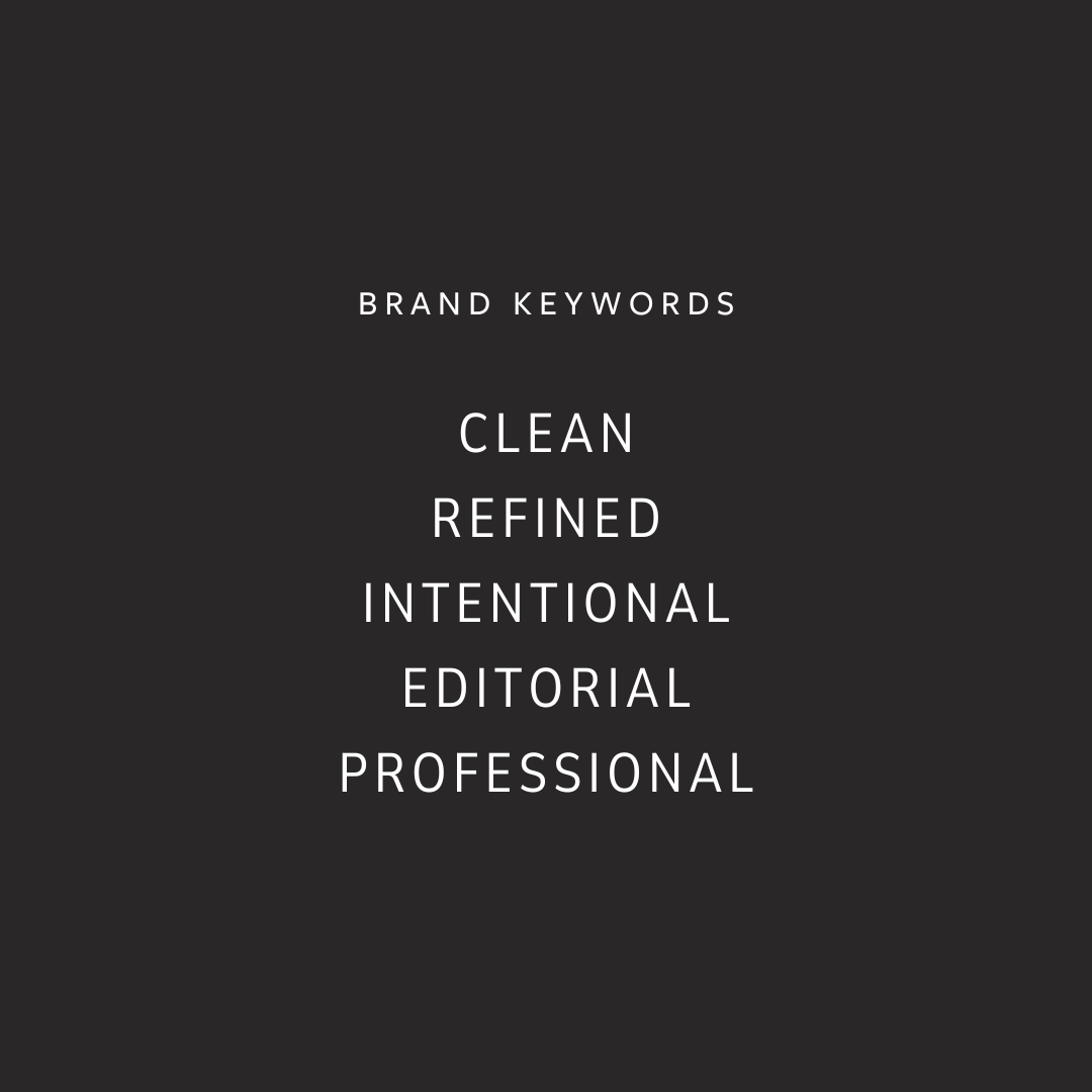
Clean, refined, intentional, editorial, professional
These words become your filter. If a design choice doesn’t align with at least three of them, it probably doesn’t belong in your brand!
Step 4: Explore core brand aesthetics
This is where moodboards actually become helpful, without being overwhelming. Instead of collecting random inspiration, start looking for patterns. Which overall aesthetic do you consistently gravitate toward, and which one aligns with your audience and values?
Below are a few common brand aesthetics you may recognize 👇
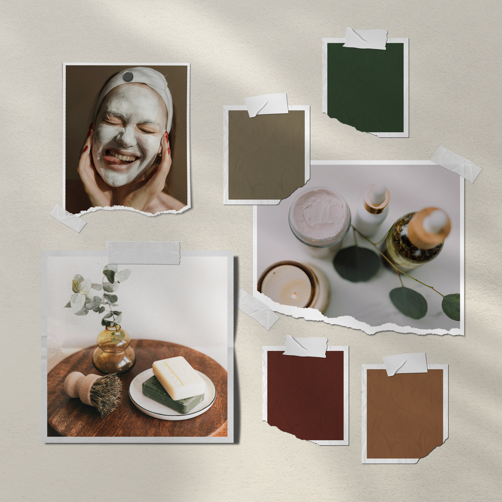
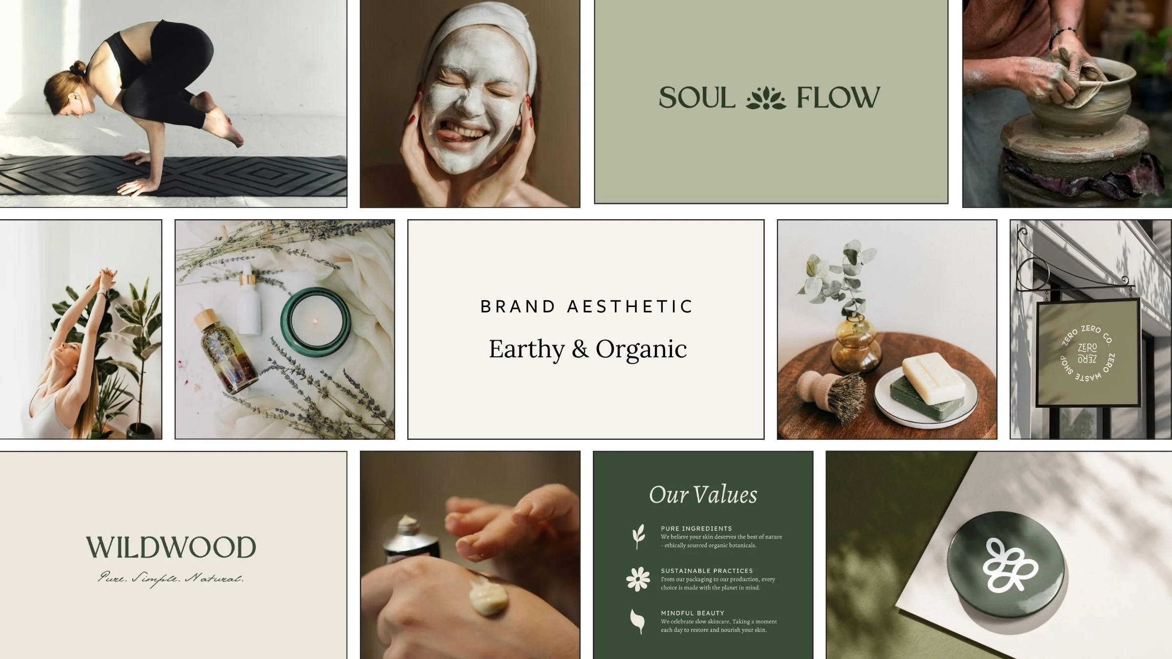
Earthy & Organic
This aesthetic feels calm, grounded, and natural. It blends earthy neutrals, soft greens, warm tones, clay hues, and organic textures to create a sense of ease and trust.
This style works beautifully for wellness brands, coaches, yoga teachers, and holistic or values-led businesses that want to feel established, reliable, and deeply aligned with their mission.
If you’re leaning toward an earthy and organic aesthetic, you’ll likely love my Wildwood, Soul Flow, or Wellness Wave brand kits. They’re pre-designed visual identities created to help values-led brands feel calm, grounded, and trustworthy from day one.
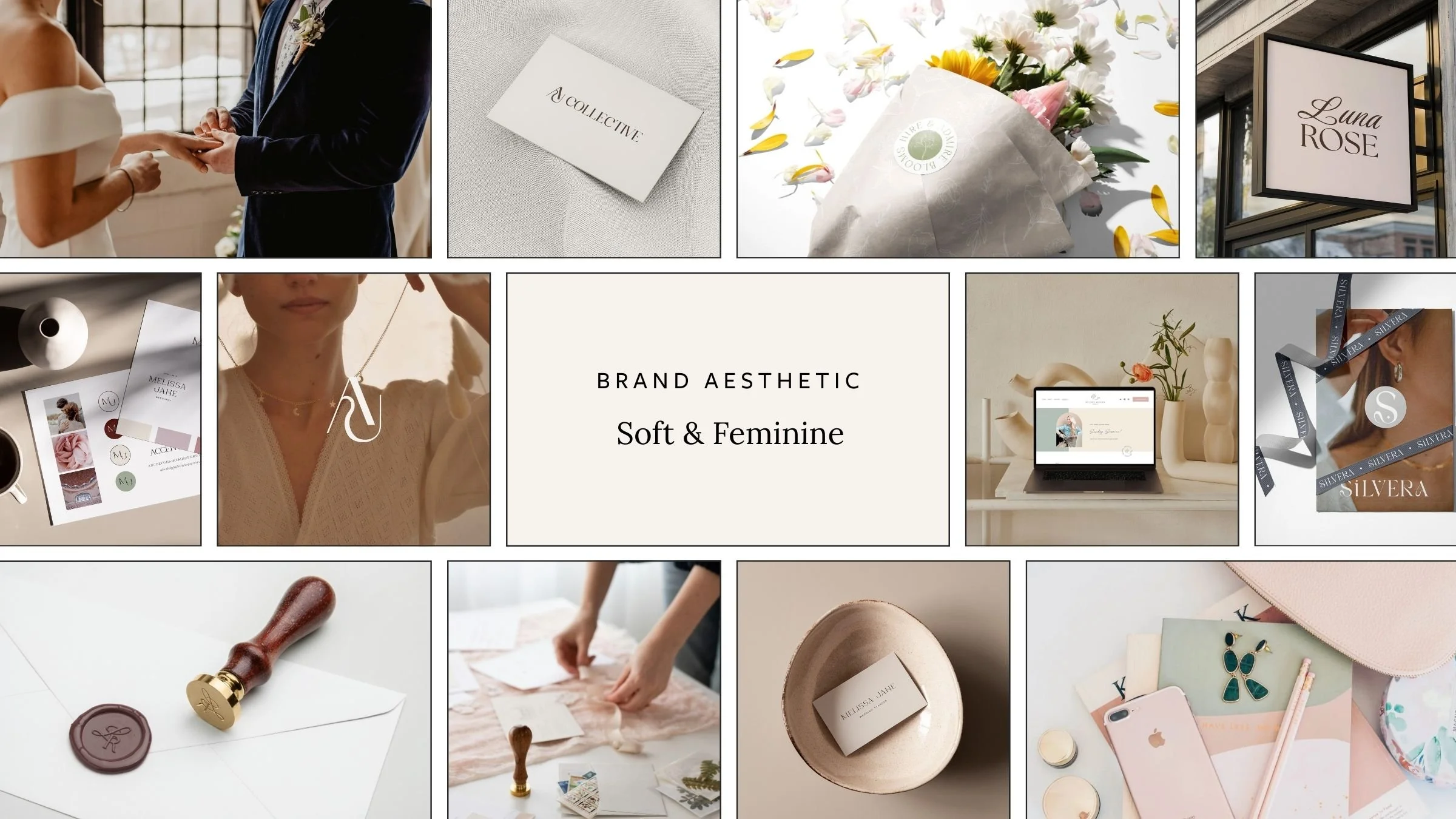
Soft & Feminine
Soft romantic branding feels feminine, elegant, and emotionally led. It often uses muted color palettes, blush tones, gentle contrasts, flowing typography, and light, airy photography.
This aesthetic works well for brands that want to feel personal, intimate, and heart-centered, such as wedding professionals, personal brands, coaches, and creative businesses built around connection and storytelling.
If soft, romantic branding feels most aligned, Luna Rose is a feminine brand kit designed for emotionally led, heart-centered businesses that want to feel elegant and personal.
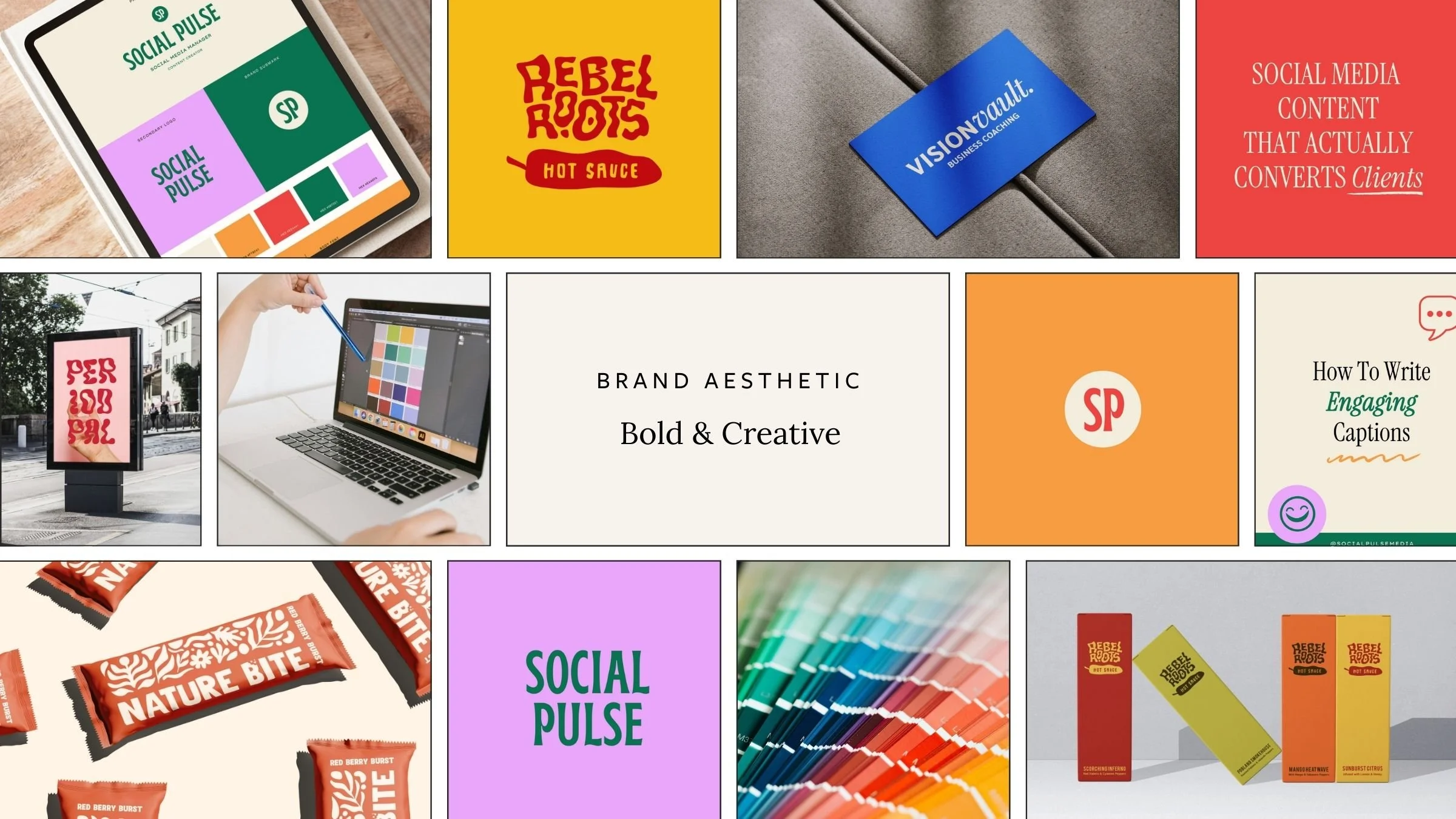
Bold & Creative
Bold creative branding is expressive, confident, and energetic. Think high-contrast color palettes, statement typography, playful layouts, and design choices that feel modern and intentional.
This style suits designers, creatives, founders, and brands that want to stand out, make a statement, and attract confident, forward-thinking clients who value originality.
If you’re drawn to bold color, expressive typography, and confident visuals, take a look at the Fierce Focus or Social Pulse brand kits, both created for modern, creative businesses that want to stand out.
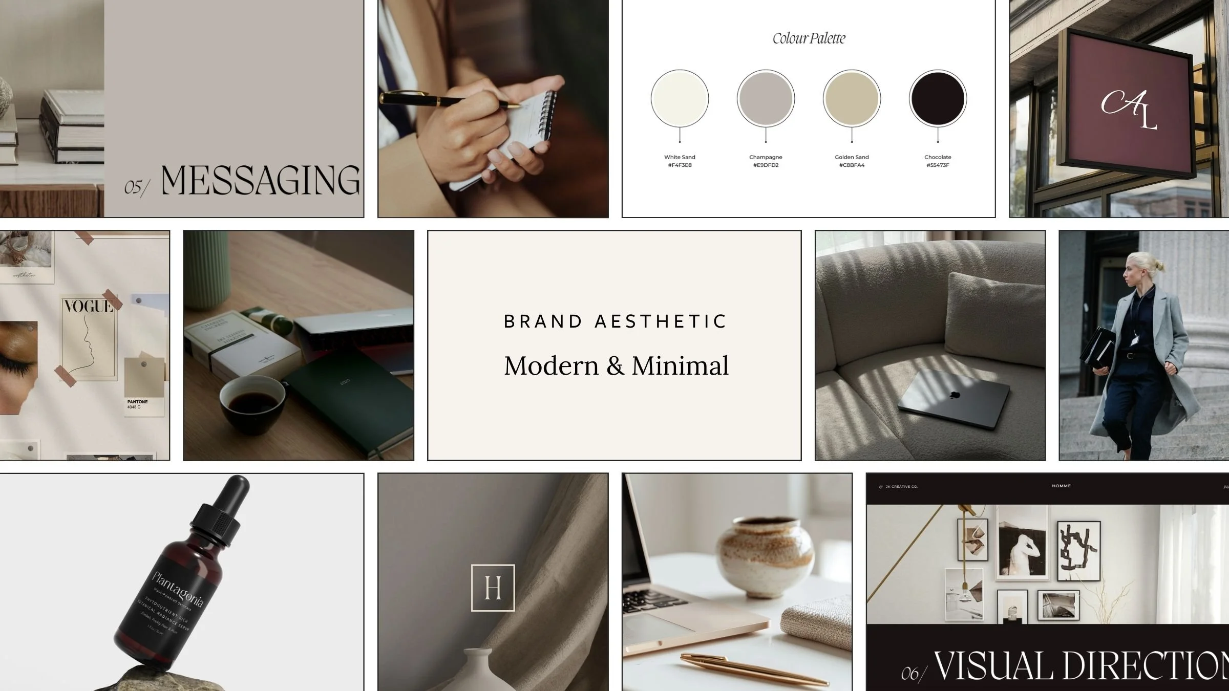
Modern & Minimal
Clean, simple, and intentional, with strong editorial vibes. This aesthetic relies on generous whitespace, neutral palettes, and refined typography that feels considered and confident.
It appeals to brands that value clarity, professionalism, and ease. It works especially well for designers, consultants, strategists, and service-based or premium businesses that want to feel polished, credible, and well-established.
If modern, editorial branding feels most aligned, Clarity Haus is a clean, minimal brand kit designed for service-based and professional brands. It’s a simple starting point if you value clarity, structure, and a refined visual presence.
Step 5: Choose your closest matching aesthetic
You may like elements of more than one aesthetic, and that’s normal. But a common branding mistake people make is trying to combine multiple aesthetics that don’t naturally align. For example: Soft, nurturing messaging paired with aggressive, high-contrast visuals, or luxe pricing with overly casual or playful branding.
Instead of feeling unique, the brand feels unclear. When clients feel confused, they hesitate.
When choosing your brand aesthetic, come back to this simple framework:
Get clear on your ideal client
Define your mission and values
Choose five brand keywords
Identify the closest matching aesthetic
Make visual decisions that support all of the above
Branding doesn’t need to feel overwhelming. With the right foundation, every decision becomes easier and more confident! ✨
Create a Brand That Feels Put Together
If your current branding feels pieced together from mismatched templates, it can be hard to feel confident showing up, even when you know your work is genuinely good! My premium Canva brand kits give you a complete, cohesive brand identity, including logos, colors, fonts, and templates that are designed to work together. Each kit is professionally designed for you, then made easy to customize yourself, so you can achieve a polished, professional look without the cost of custom branding.

Meet the Designer
Hey, I’m Joanna, a UK-based brand identity designer and founder of JK Creative Co. After 5+ years designing for startups, creatives, and purpose-led businesses, I’ve shifted my focus to making beautiful, strategic branding more accessible. Through my collection of premium brand kits, I help small business owners and entrepreneurs launch with confidence - no custom process or big agency budget required.
💡 Want to see how I can support your brand? Explore the kits →