10 Bold Color Palettes to Inspire a Stand-Out Brand Identity
Bold branding isn’t just a design choice, it’s about showing personality and creating instant impact. A confident color palette helps your brand feel energetic, modern, and impossible to ignore, so whether you’re a coach, creative, educator, wellness brand, or small business owner, choosing expressive, high-contrast colors can help your message stop the scroll and make an impression.
In this post, you’ll find 10 bold palette ideas, plus real examples showing how these palettes come to life in branding. So grab a drink, scroll slowly, save your favorites, and let’s explore the power of bold color!

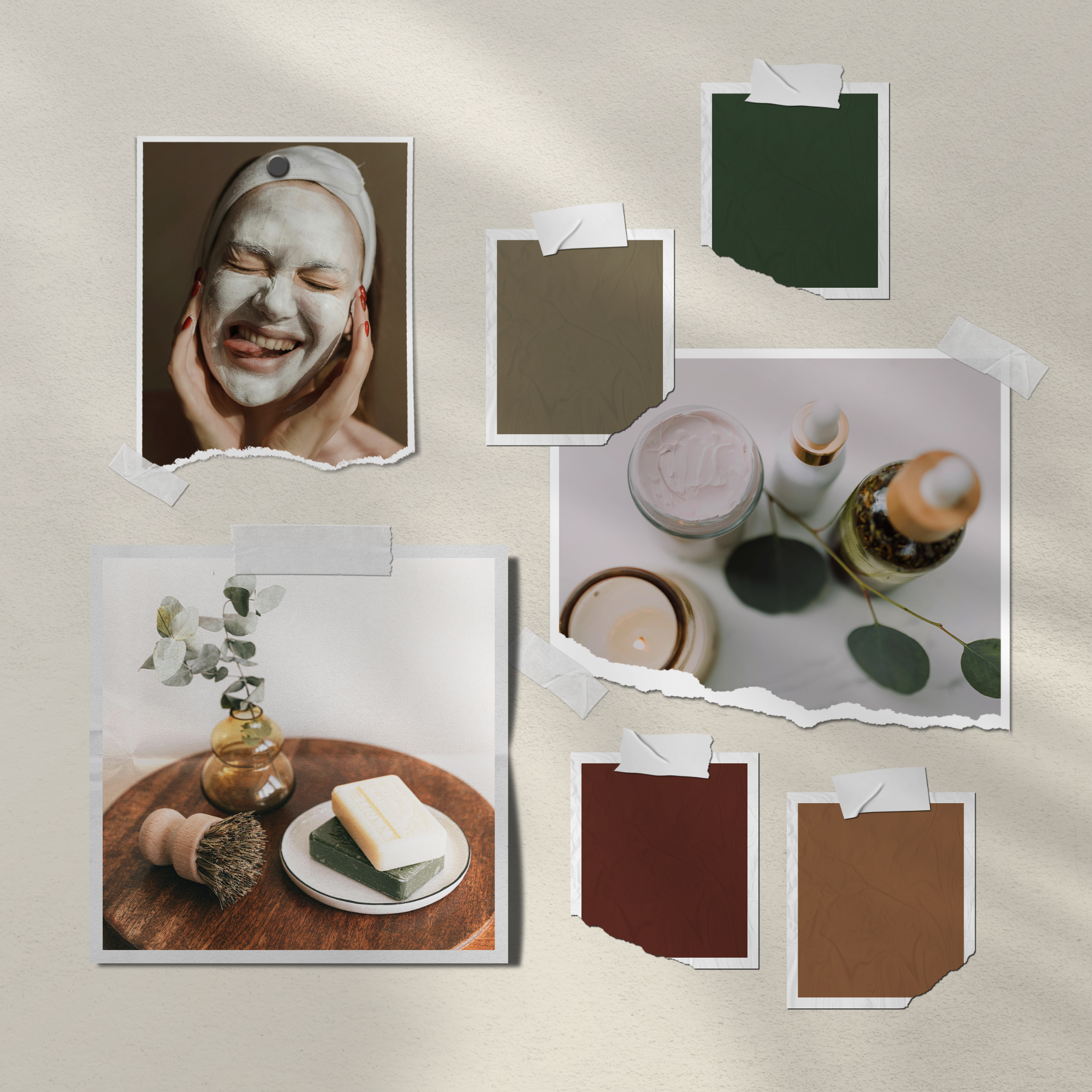
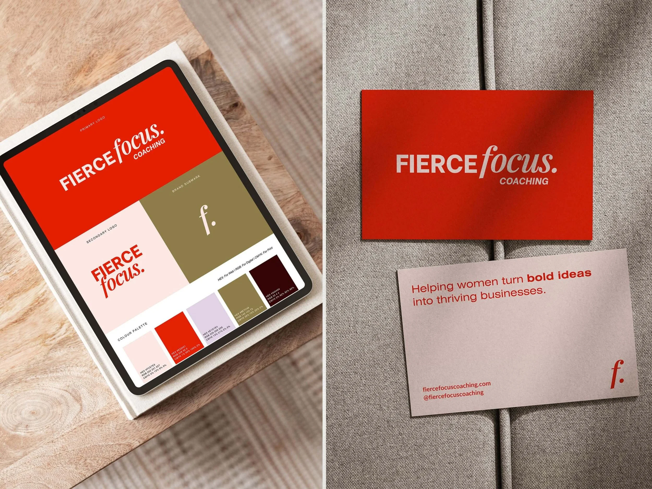
1. Fierce Focus
Mood: Confident · High-energy · Impactful
Perfect for: Coaches, consultants, speakers, bold personal brands.
This palette leans into striking contrast with a fiery red accent balanced by soft neutrals and grounded olive tones. It’s unapologetic and designed to be noticed - perfect if your brand needs presence, authority, and personality.
See how it looks in a full brand identity:
These colors are used in the Fierce Focus Brand Kit, where the palette supports clean layouts, confident typography, and bold messaging.
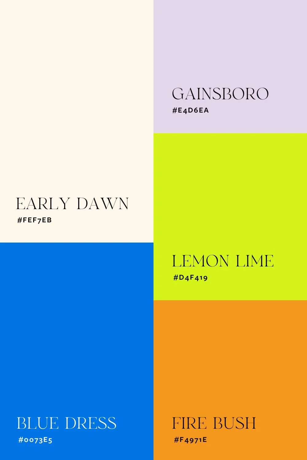
2. Vision Vault
Mood: Bold · Creative · Vibrant
Perfect for: Content creators, motivational brands, educators, and coaches
This palette brings together saturated brights and soft supporting tones to create a confident, scroll-stopping look. The vibrant blue and neon lime inject energy and creativity, while the softer lilac and cream help balance the intensity.
See how it looks in a full brand identity:
This color set is a customized version of the Fierce Focus Brand Kit. It’s a great example of how changing the palette can give an existing brand kit a completely different personality, while still keeping typography, structure, and layout consistent.


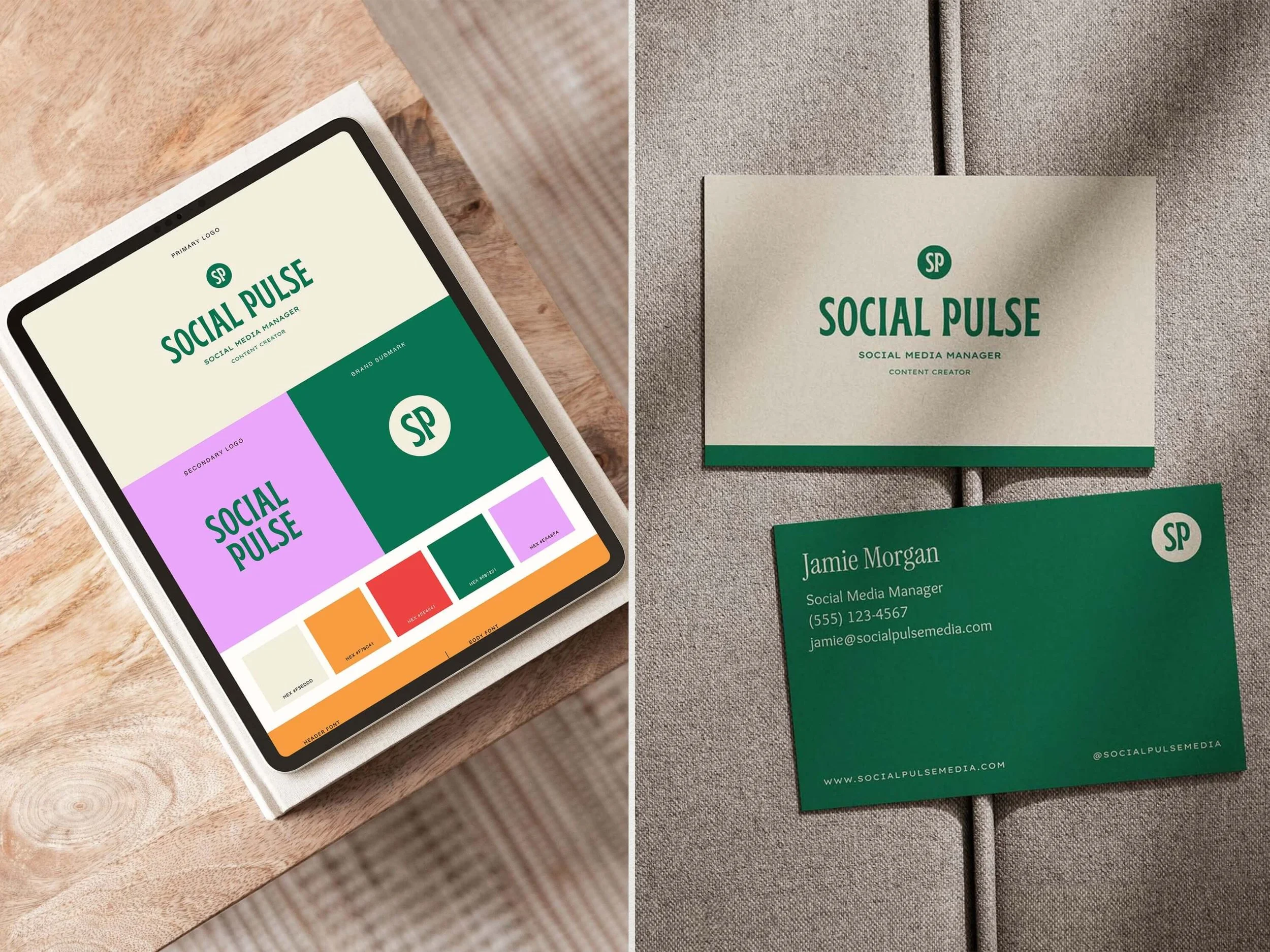
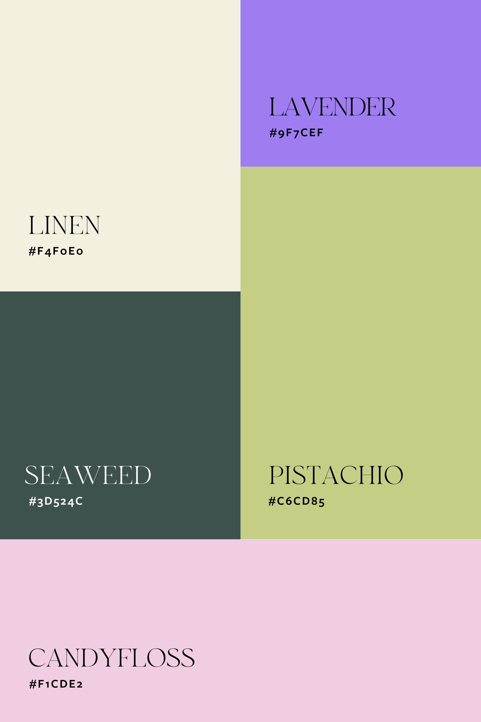
3. Social Pulse
Mood: Playful · Modern · Energetic
Perfect for: Creators · Educators · Social media brands
This palette leans into bright, expressive tones that feel lively without being overwhelming. The bold primaries paired with softer supporting shades make it balanced yet memorable - perfect if you want branding that feels creative, upbeat, and full of personality.
See how it looks in a full brand identity:
These colors are used in the Social Pulse Brand Kit, where the palette brings a fun, welcoming feel to clean layouts and modern typography.

4. Naomi Brooks
Mood: Spirited · Modern · Personality-packed
Perfect for: Coaches, personal brands, and service-based creatives
This palette blends energetic brights with softer supporting tones to create a bold look that still feels approachable. The warm red-orange adds confidence and drive, while the cool blues and greens introduce balance and calm - making the overall feel expressive, modern, and grounded.
See how it looks in a full brand identity:
These colours are a customised version of the Social Pulse Brand Kit. It’s a great example of how colour alone can shift the emotion of a brand while the structure, layout, and typography remain the same.

More Bold Color Palette Inspiration
These palettes are ready to screenshot, save, and experiment with - whether you’re building from scratch or customizing a done-for-you brand kit.


Feeling drawn to lots of different styles?
That’s completely normal. Before choosing colors or templates, it helps to get clear on the brand aesthetic that actually fits your business and attracts the right clients. I wrote a blog post to help you figure this out.

Meet the Designer
Hey, I’m Joanna, a UK-based brand identity designer and founder of JK Creative Co. After 5+ years designing for startups, creatives, and purpose-led businesses, I’ve shifted my focus to making beautiful, strategic branding more accessible. Through my collection of premium brand kits, I help small business owners and entrepreneurs launch with confidence - no custom process or big agency budget required.
💡 Want to see how I can support your brand? Explore the kits →