3 Logo Variations Your Brand Needs
Let’s talk about your logo, and why having just one version often isn’t enough. Imagine you have a single logo with your full business name and tagline. It looks great on your website, but then you try to use it as your Instagram profile photo. Suddenly it’s cropped, tiny, and completely unreadable. Not ideal, and definitely not professional.
That’s where logo variations come in.
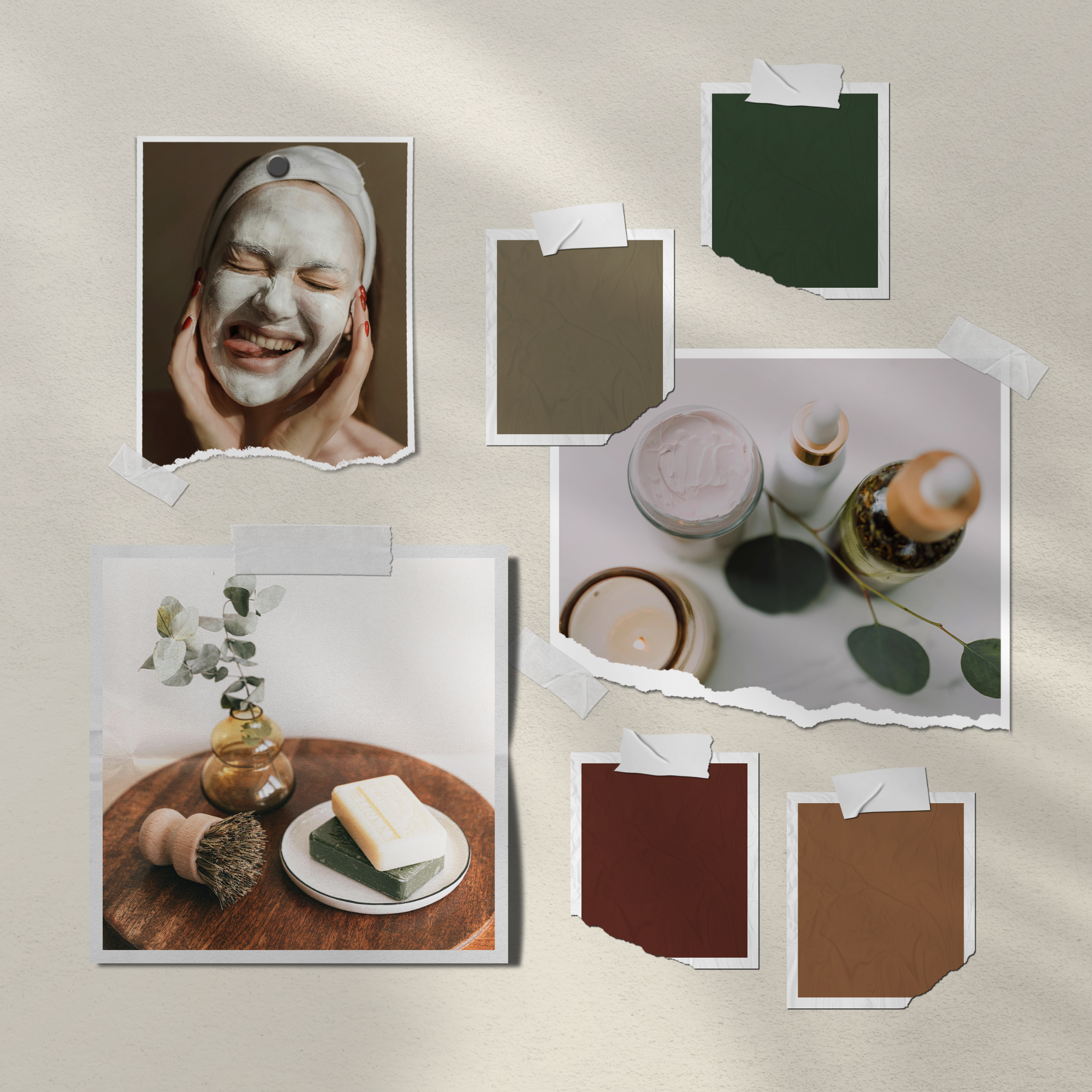
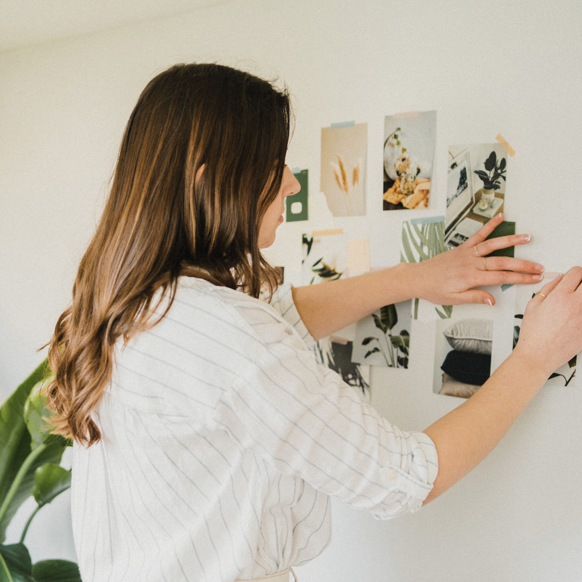
They’re not totally different designs, but rather simplified versions of your core logo that flex for different spaces and formats. Each variation keeps your branding recognisable and cohesive, but allows you to show up consistently across every touchpoint - from your website and social media to packaging, business cards, and email signatures.
Here’s what that looks like 👇
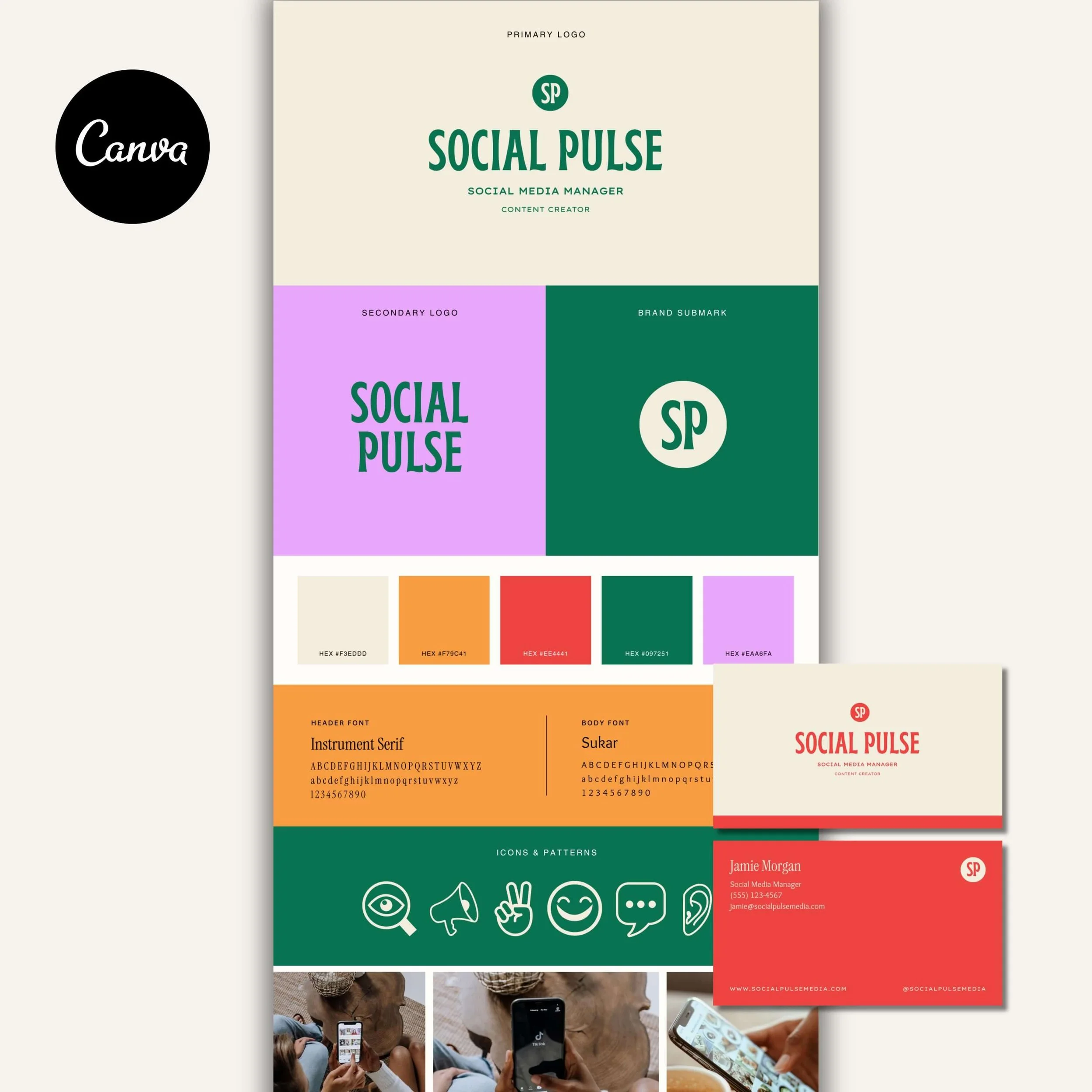
1. Primary Logo
‘Primary Logo’ is designer speak for your main logo. This is the full design, the largest version that usually includes your business name and tagline. It’s the one that sets the tone for your brand and is often the most detailed.
Best used for: your website header, stationery, proposals, and anywhere you have room to breathe.
The image below is an example of the primary logo from my Luna Rose Brand Kit. You can see how this version of the logo is long and horizontal, including the tagline for a more complete layout - and how it translates beautifully when used on a business card.
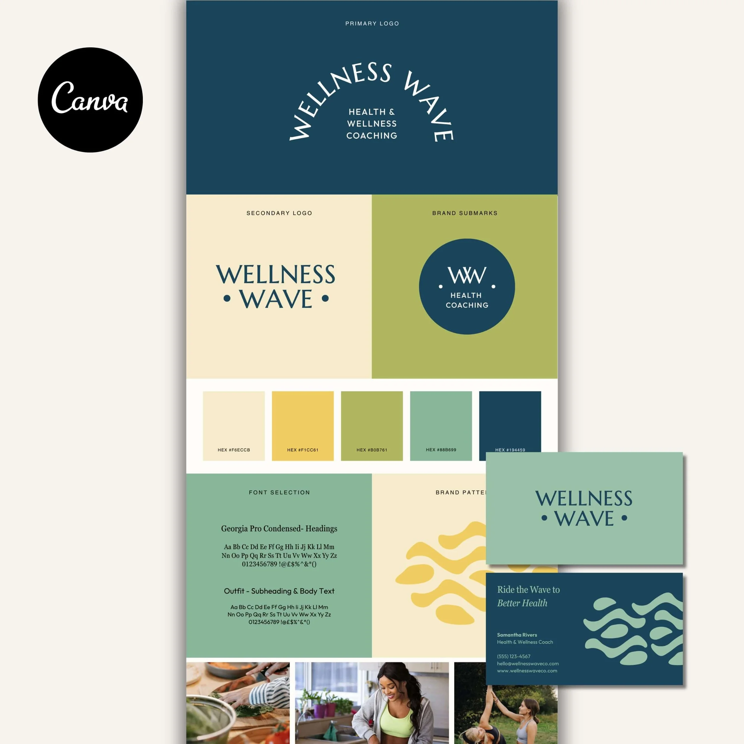
2. Secondary Logo
Your ‘Secondary Logo’ is a simplified version of your main logo - often stacked, or without the tagline. It keeps your brand instantly recognizable but adapts better to smaller or narrower spaces.
Best used for: social media headers, marketing graphics, email signatures, or signage where your full logo feels too detailed.
Below, you can see the secondary logo from my Luna Rose Brand Kit. This layout removes the tagline and stacks the text for a more compact shape, making it perfect for smaller applications like storefront signs or profile headers while still feeling elegant and cohesive.
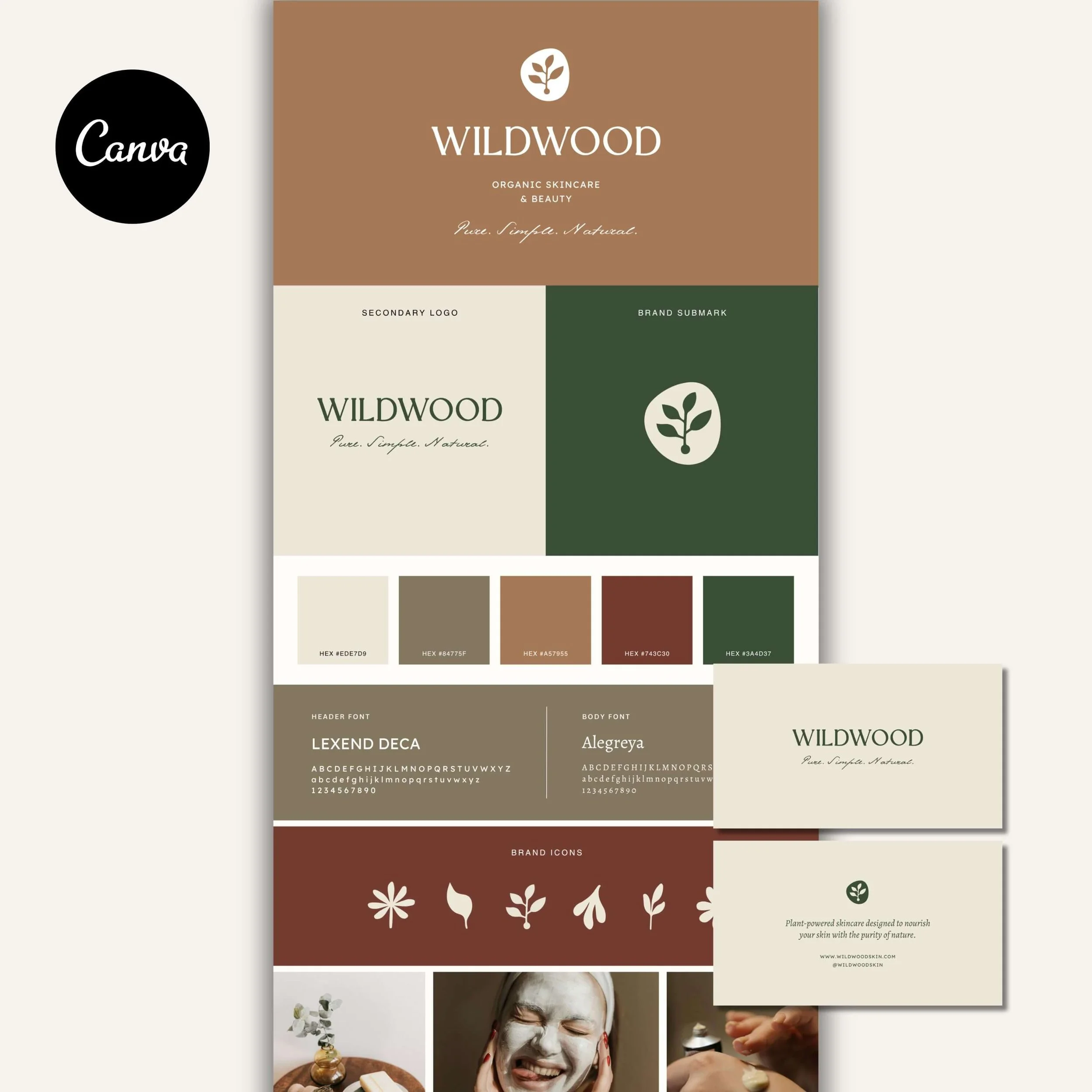
3. Submark/Brand Icon
Your ‘Submark’ (or brand icon) is the simplest version of your logo - often just your initials, monogram, or a small brand symbol. It’s designed to be clean and minimal while still instantly recognizable as part of your overall identity.
Best used for: watermarks, favicons, packaging stamps, or email signatures - anywhere a full logo would be too detailed or distracting.
Below, you can see the submark from my Luna Rose Brand Kit. This version features the initials “L” and “R” intertwined to create an elegant mark that works perfectly as a wax seal, social icon, or subtle branded accent across packaging and stationery.
It’s these small details that elevate a brand from amateur to unforgettable. Having a cohesive set of logo variations makes your business feel intentional, professional, and ready to shine across every touchpoint, from your website to your packaging.
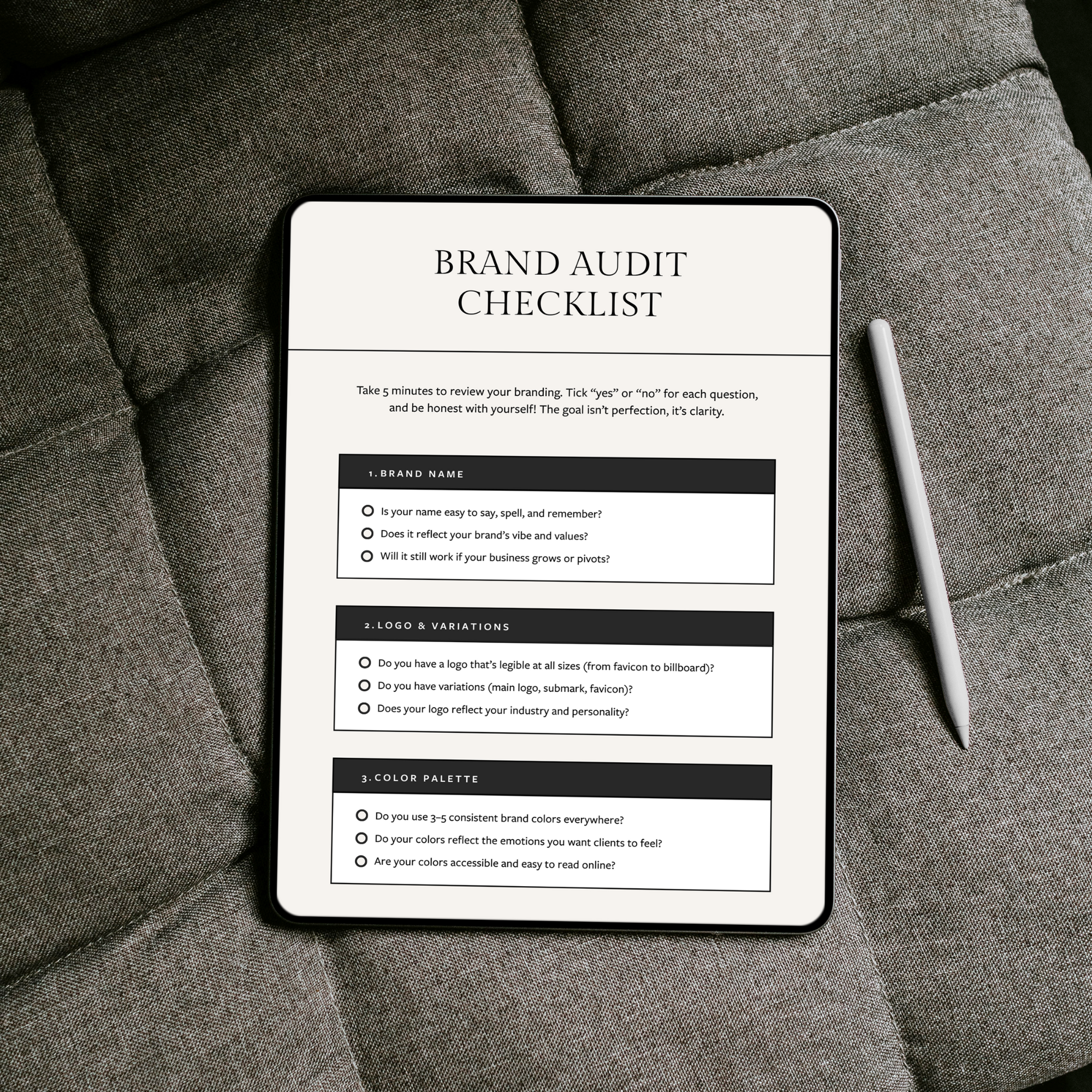
💡 Tip: Save this checklist or pin it on Pinterest so you can come back to it whenever you’re reviewing your branding.
Create a Brand That Feels Put Together
If your current branding feels pieced together from mismatched templates, it can be hard to feel confident showing up, even when you know your work is genuinely good! My premium Canva brand kits give you a complete, cohesive brand identity, including logos, colors, fonts, and templates that are designed to work together. Each kit is professionally designed for you, then made easy to customize yourself, so you can achieve a polished, professional look without the cost of custom branding.

Meet the Designer
Hey, I’m Joanna, a UK-based brand identity designer and founder of JK Creative Co. After 5+ years designing for startups, creatives, and purpose-led businesses, I’ve shifted my focus to making beautiful, strategic branding more accessible. Through my collection of premium brand kits, I help small business owners and entrepreneurs launch with confidence - no custom process or big agency budget required.
💡 Want to see how I can support your brand? Explore the kits →