10 Earthy Color Palettes for Wellness Brands
Earthy branding isn’t about playing it safe. It’s about creating trust, warmth, and a sense of calm, while still feeling intentional and professional.
Natural color palettes help brands feel grounded, organic, and human. They’re especially powerful for wellness brands, coaches, creatives, and purpose-led businesses that want to connect emotionally without shouting.
In this post, you’ll find 10 earthy color palette ideas, plus real brand kit examples showing how these palettes come to life in full brand identities. So grab a coffee, scroll slowly, save your favorites, and let’s explore the power of earthy color 🍂
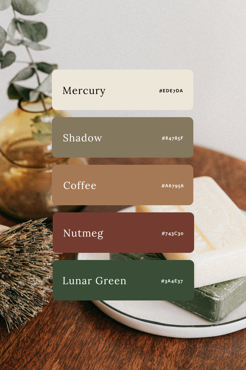
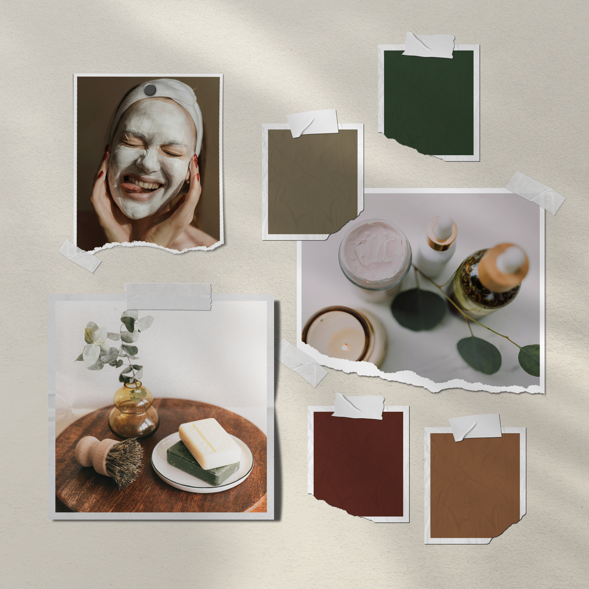
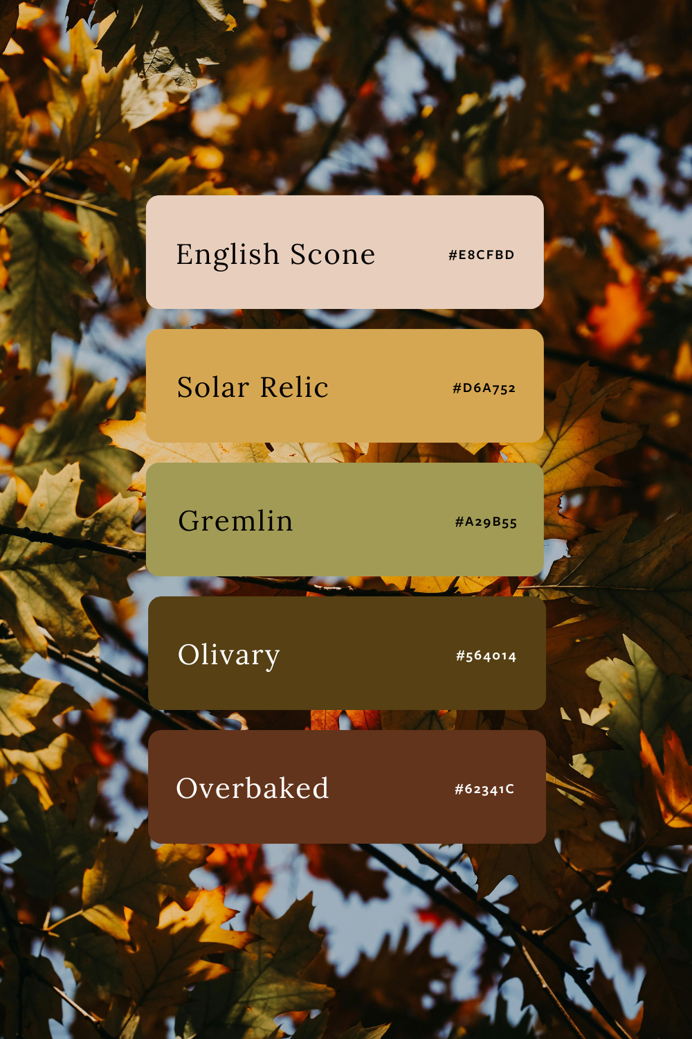
1. Wildwood
Mood: Grounded · Organic · Calm
Perfect for: Wellness brands, holistic services, eco-conscious creatives
Wildwood is built around nature-inspired neutrals, soft greens, and earthy browns. It feels calm, grounded, and timeless, without feeling generic. This palette is ideal for brands that want to feel trustworthy, natural, and quietly confident.
See how it looks in a full brand identity:
These colors are used in the Wildwood Brand Kit, where the palette supports gentle layouts, organic typography, and a grounded visual flow.
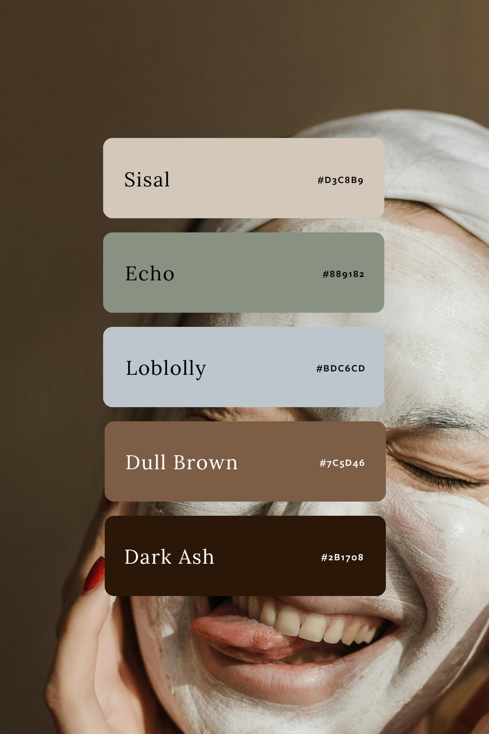
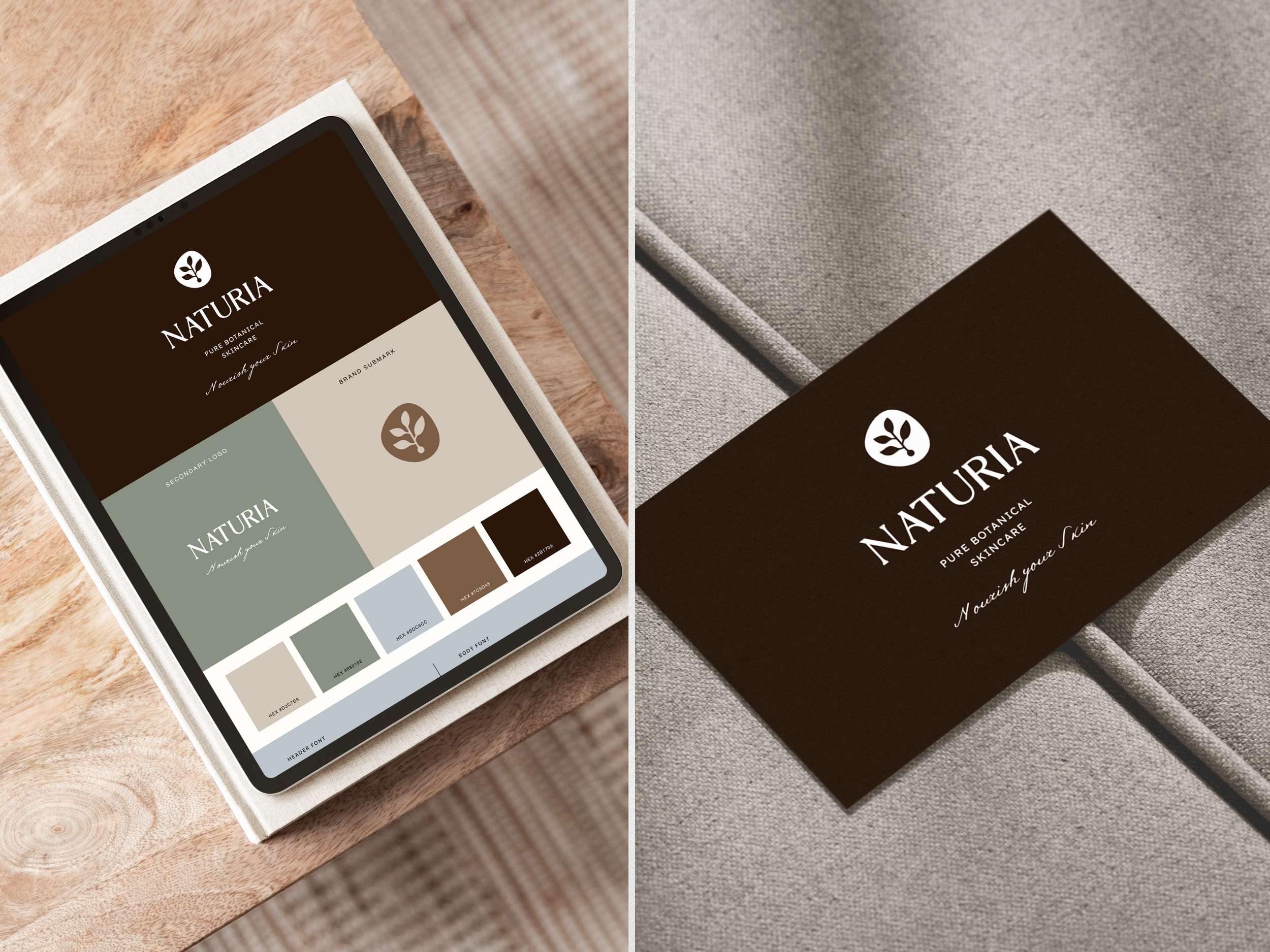
2. Naturia
Mood: Soft · Fresh · Organic
Perfect for: Wellness coaches, mindful businesses, natural product brands
This palette leans lighter and fresher, with softer neutrals and gentle green tones that feel airy and nurturing. It’s ideal if you want a natural look that feels uplifting and approachable, rather than earthy and grounded.
See how it looks in a full brand identity:
Naturia is a customized color variation of the Wildwood Brand Kit, showing how a shift in color alone can completely change the feel of a brand, while keeping the same structure and typography.
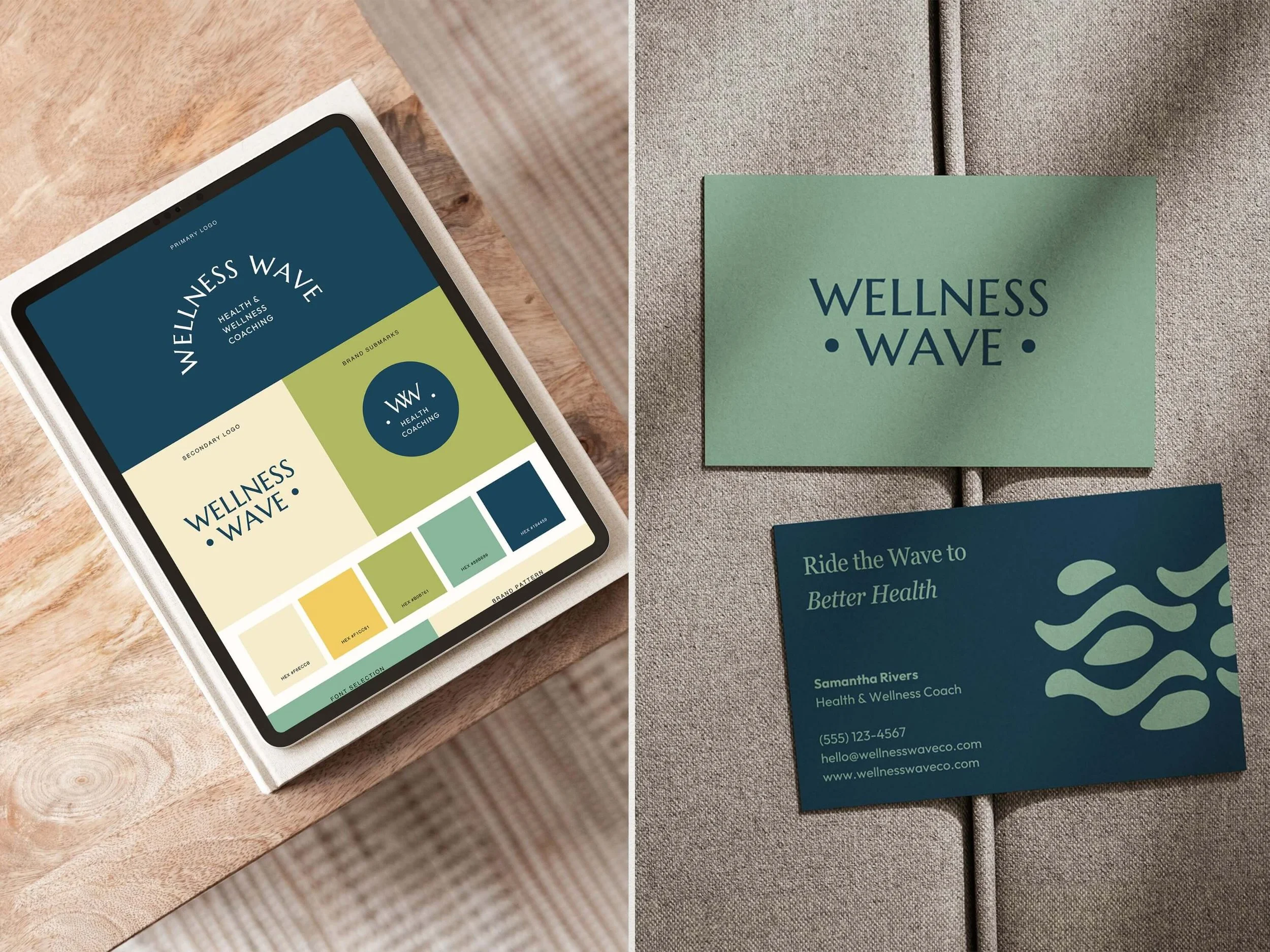
3. Wellness Wave
Mood: Calm · Balanced · Restorative
Perfect for: Wellness professionals, therapists, holistic practitioners
Wellness Wave blends soothing neutrals with muted greens and soft accent tones to create a palette that feels peaceful and restorative. It works especially well for brands that want clients to feel safe, supported, and relaxed the moment they land on your website or socials.
See how it looks in a full brand identity:
These colors are used throughout the Wellness Wave Brand Kit, where the palette enhances clarity, consistency, and a calm user experience.
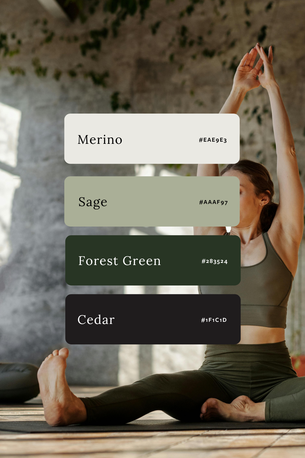
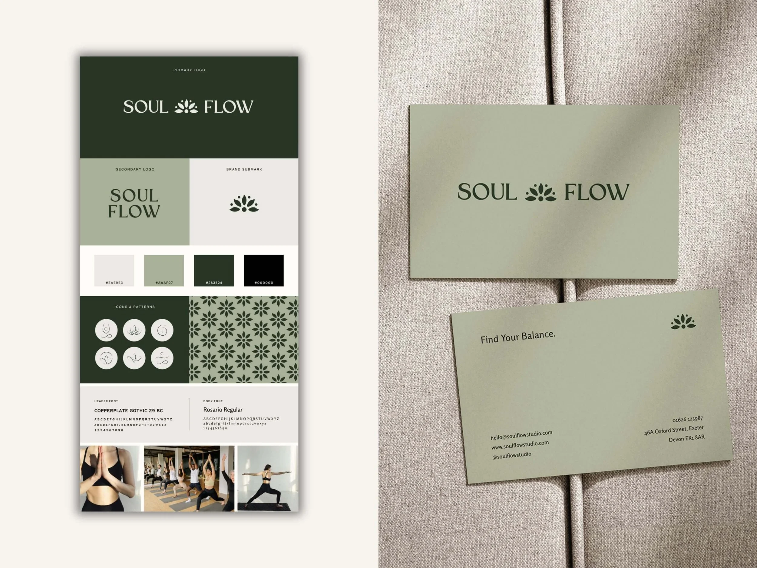
4. Soul Flow
Mood: Soft · Grounded · Nurturing
Perfect for: Yoga teachers, therapists, holistic and heart-led brands
Soul Flow blends gentle neutrals with calming greens and deep grounding tones to create a palette that feels supportive, balanced, and emotionally warm. This palette is ideal if you want your brand to feel calming and natural without losing depth or professionalism.
See how it looks in a full brand identity:
These colors are used throughout the Soul Flow Brand Kit, where the palette supports modern layouts and a calm, cohesive visual rhythm.
More Earthy Color Palette Inspiration
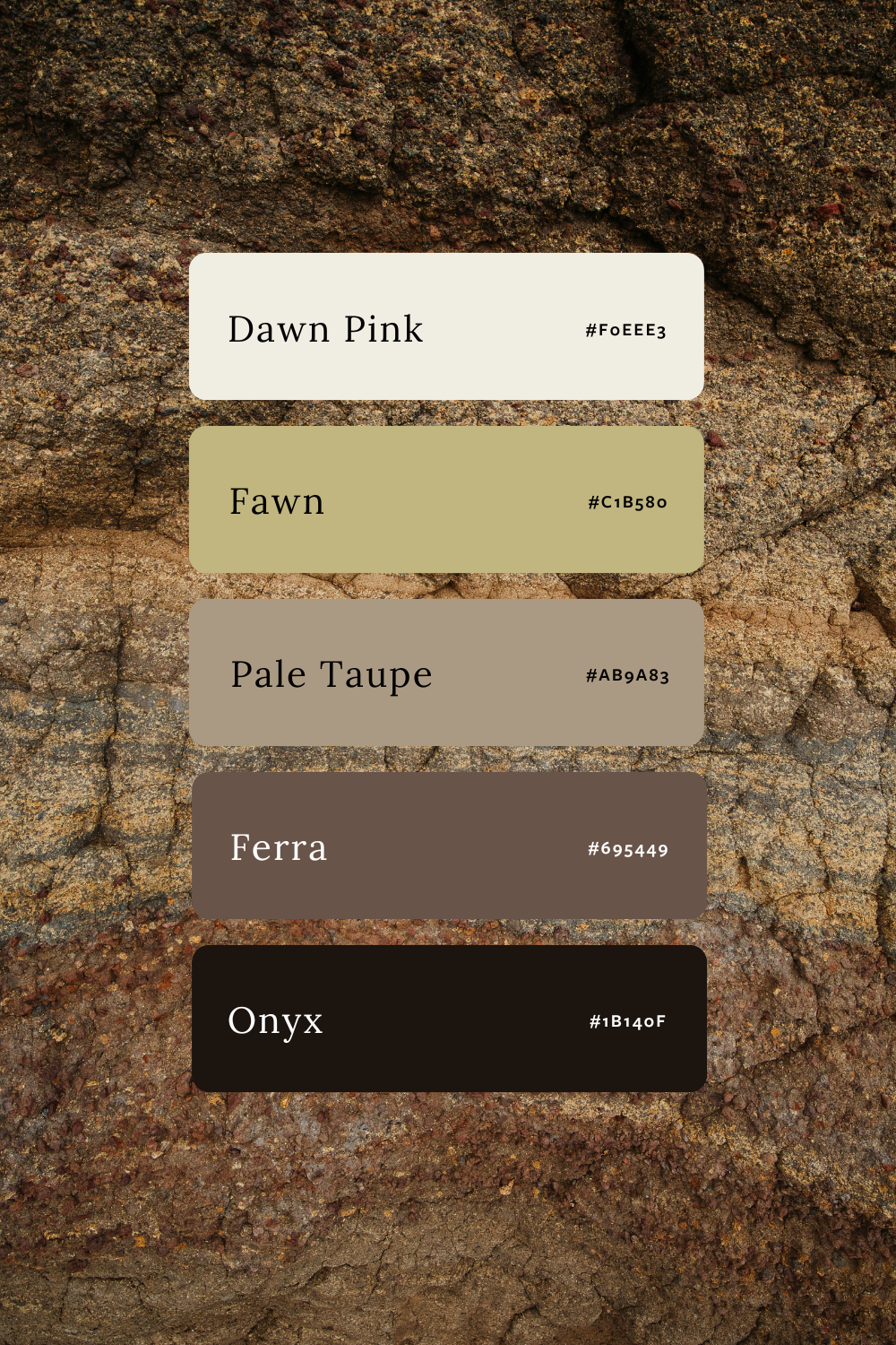
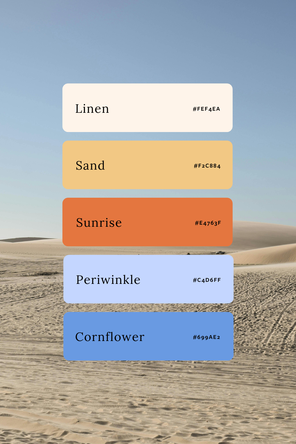
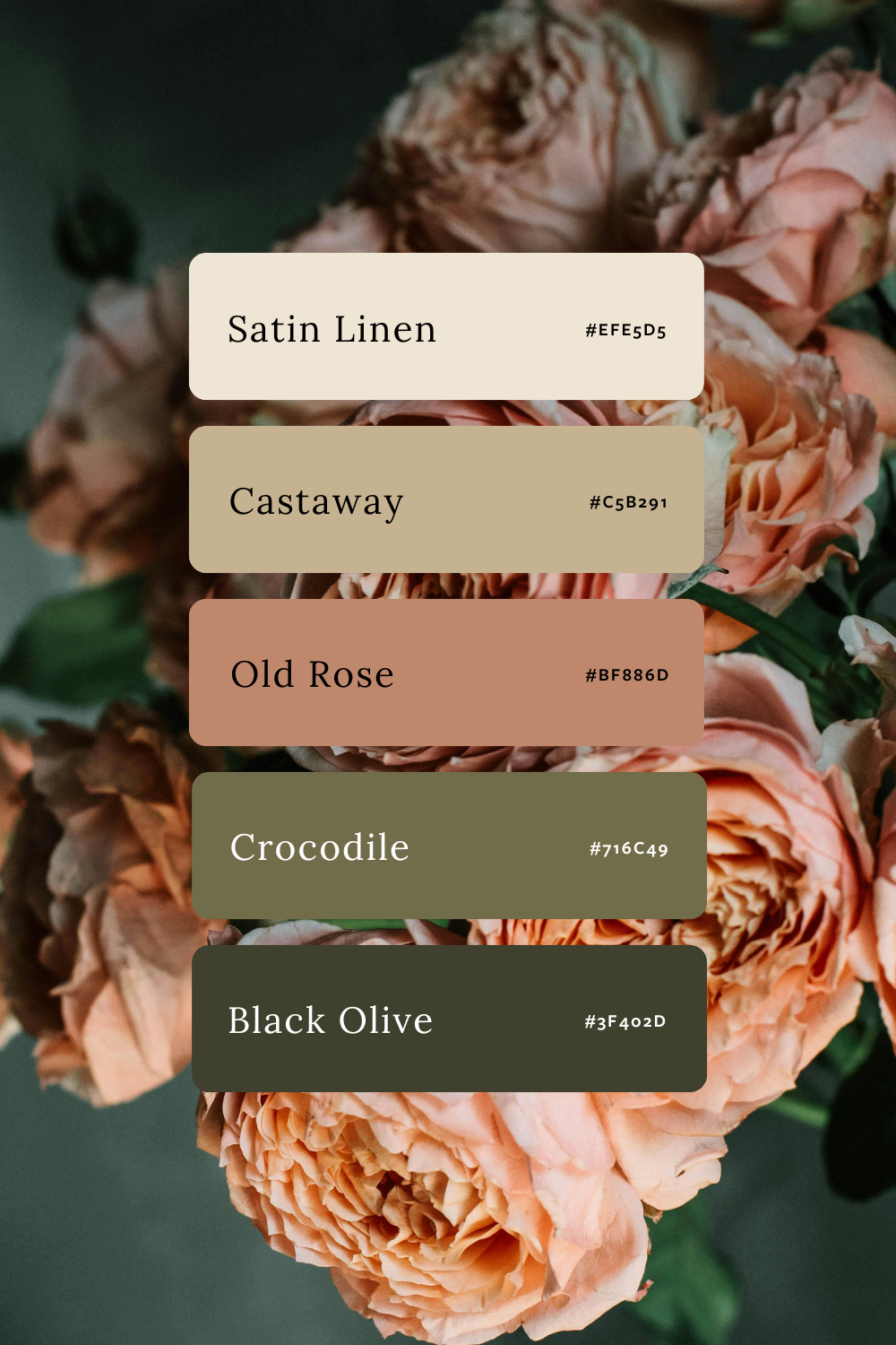
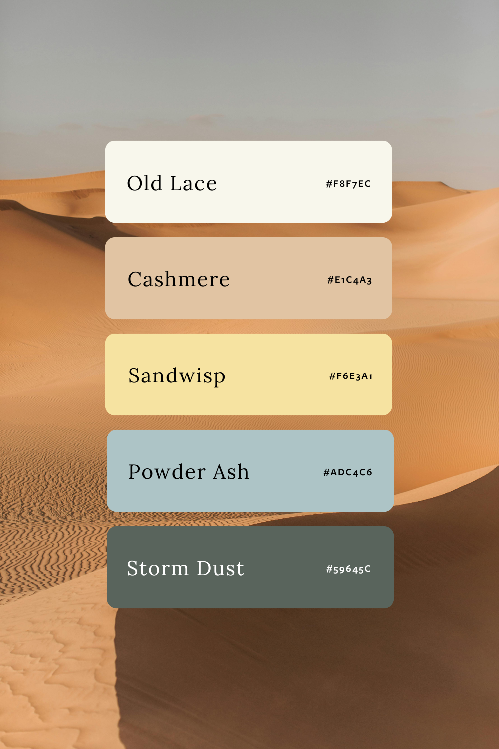
These palettes are ready to screenshot, save, and experiment with, whether you’re building from scratch or customizing a done-for-you brand kit. Feel free to pin your favorites on Pinterest so you can come back to them later.
Feeling drawn to lots of different styles?
That’s completely normal. Before choosing colors or templates, it helps to get clear on the brand aesthetic that actually fits your business and attracts the right clients. I wrote a blog post to help you figure this out.

Meet the Designer
Hey, I’m Joanna, a UK-based brand identity designer and founder of JK Creative Co. After 5+ years designing for startups, creatives, and purpose-led businesses, I’ve shifted my focus to making beautiful, strategic branding more accessible. Through my collection of premium brand kits, I help small business owners and entrepreneurs launch with confidence - no custom process or big agency budget required.
💡 Want to see how I can support your brand? Explore the kits →