What Makes a Brand Feel Professional? (Without Being Boring)
When people talk about “professional” branding, it’s easy to imagine something boring, corporate, or completely stripped of personality. 🥱 But that’s not actually what makes a brand feel professional. Some of the most professional-looking brands are creative, expressive, and full of character.
If you’ve ever looked at your brand and thought, “It’s not bad… but something still feels off”, you’re not alone. A lot of business owners end up stuck tweaking colors, swapping templates, and second-guessing every visual choice without ever feeling fully confident.
The truth is, a professional brand isn’t about doing more. It’s about making a few clear decisions, and sticking to them.
Let’s break down what actually makes a brand feel professional, and what you can stop overthinking.👇
A Professional Brand Feels Cohesive
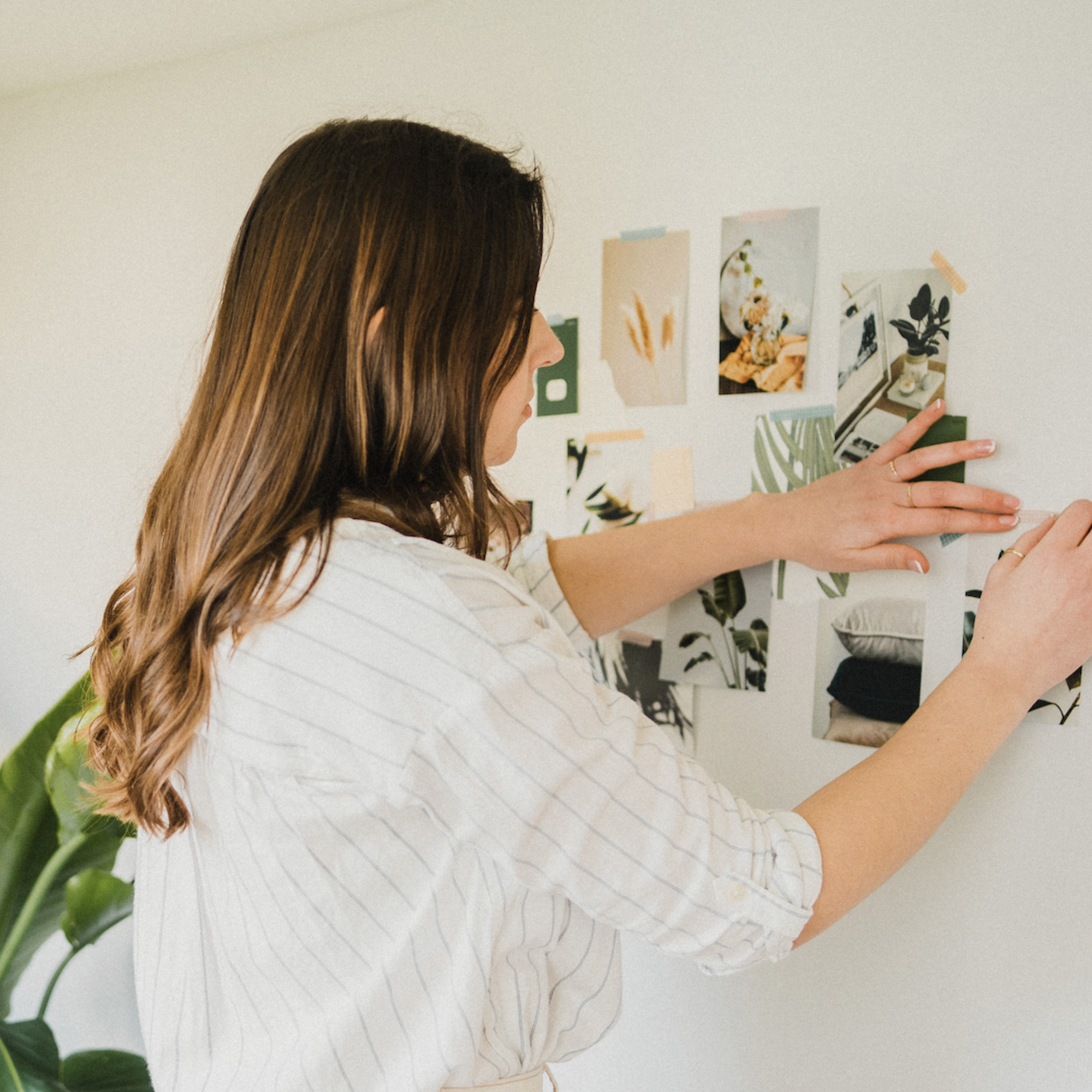
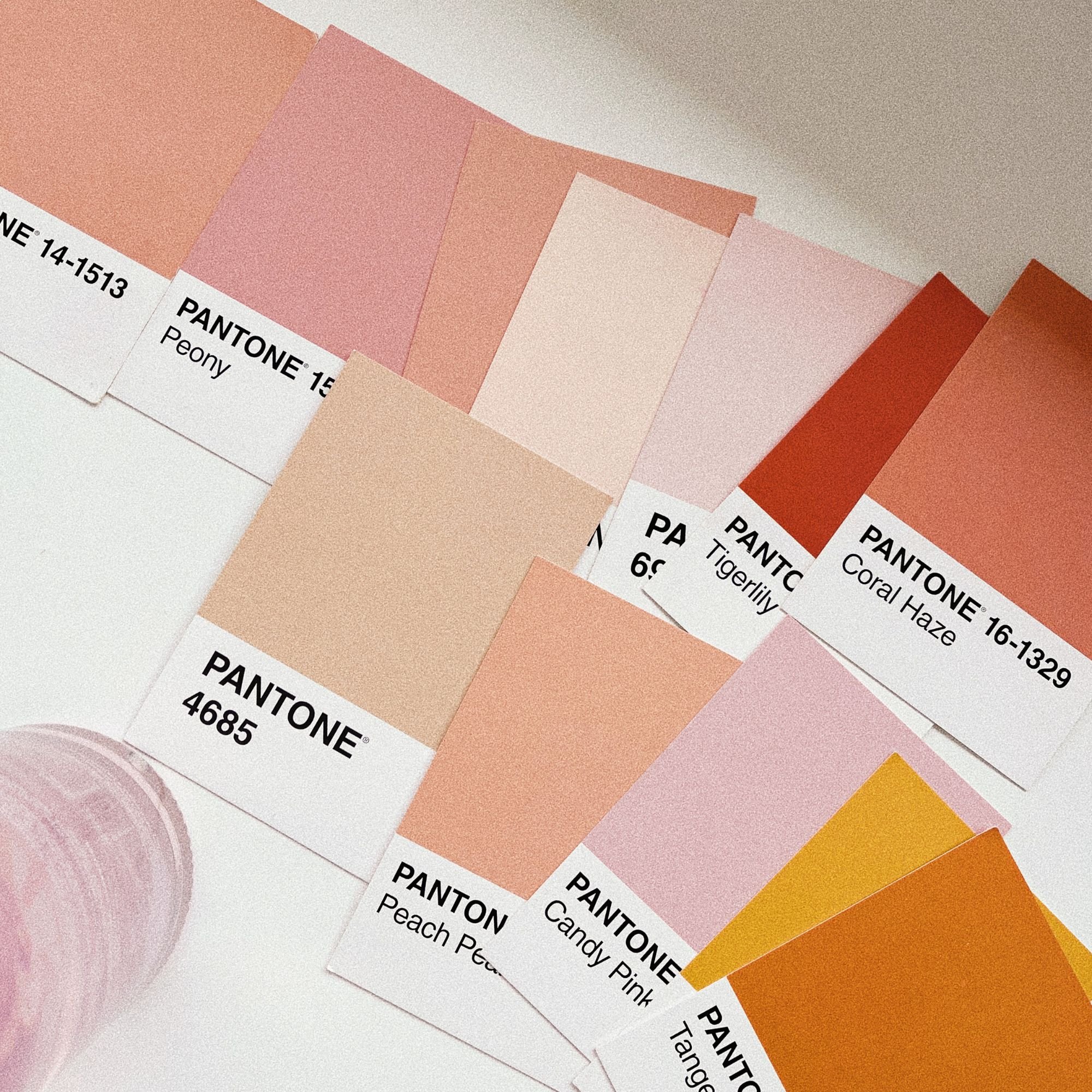
This is the big one. A professional brand feels cohesive. Everything looks like it belongs together, even if you can’t quite put your finger on why. Cohesion doesn’t come from fancy design tricks or having more assets. It comes from consistency and restraint.
Cohesive brands usually have:
A clear, limited color palette
One or two fonts used consistently
A similar visual tone everywhere they show up
When all of those elements work together, the brand feels calm, confident, and put together.
This is also why piecing together random templates often feels messy. Even if each piece looks nice on its own, without cohesion the overall brand starts to feel disconnected. Professional brands don’t constantly reinvent themselves. They repeat the same visual choices on purpose.
A Professional Brand Has a Clear Visual Direction
If your brand feels confused, it’s often because the visual direction isn’t clear. Professional brands choose a style and commit to it. They don’t try to be bold, minimalist, romantic, and playful all at the same time.
That might mean leaning into:
Bold and confident
Soft and feminine
Calm and earthy
Clean and minimalist
There’s no “better” style here. What matters is choosing a direction that suits your business and your audience, and then sticking with it.
If you’re struggling to narrow this down, I’ve written a full post on How to Choose a Brand Aesthetic That Attracts the Right Clients, which walks you through how to define a visual direction that feels aligned and intentional.
One of the biggest mindset shifts is realizing that clarity beats creativity when it comes to professionalism. A clear, consistent style will always feel more polished than a brand that’s constantly experimenting.
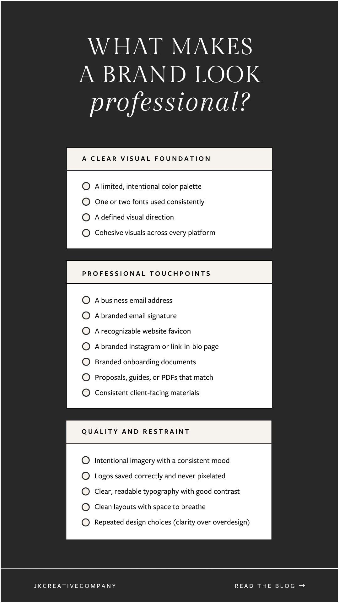
It’s the Details That Make a Brand Feel Professional
Once the big picture is in place, it’s the small details that really elevate a brand. A professional brand isn’t just about logos and color palettes. It’s about the thoughtful touches that make everything feel intentional 👇
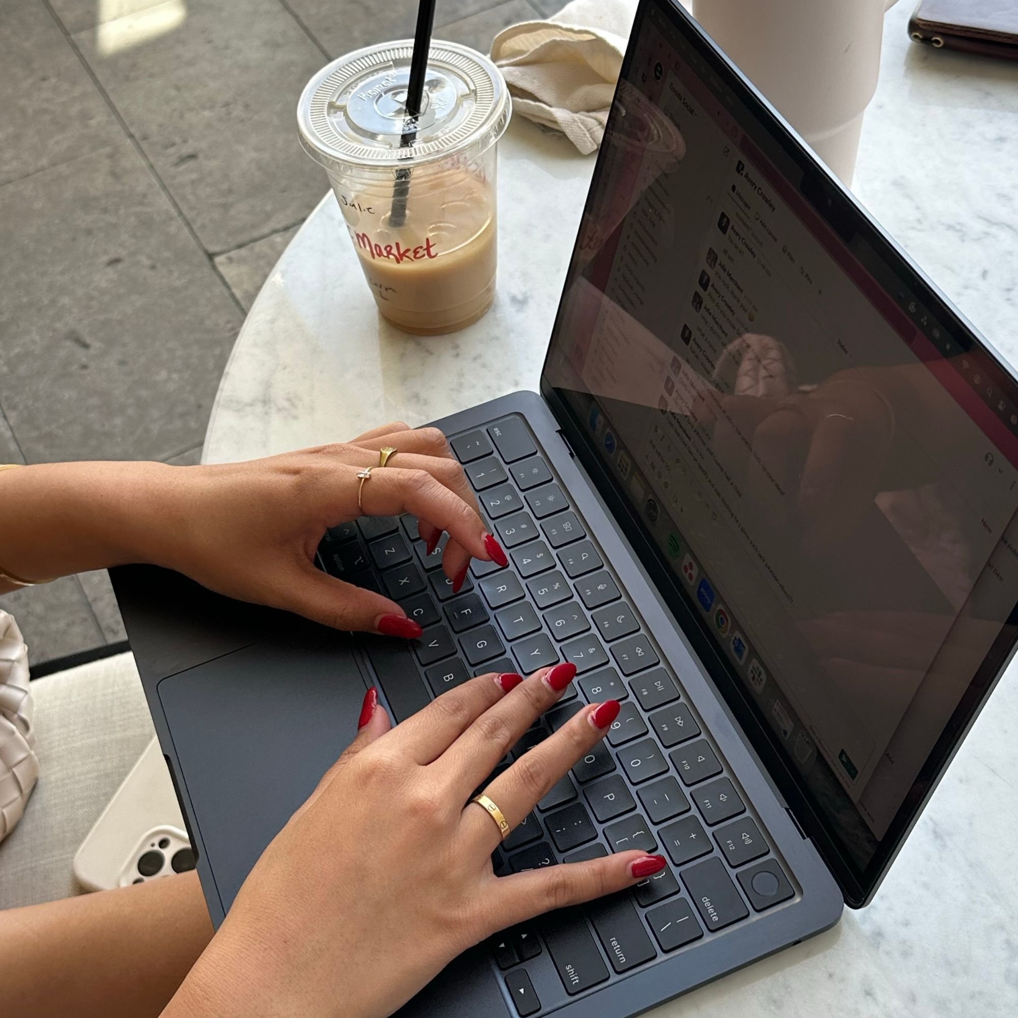
💅 Polished brand touchpoints
Professional brands think beyond social media.
That might include:
A business email address instead of personal Gmail or Instagram DMs
A branded email signature using consistent fonts and colors
An Instagram link page that matches the rest of the brand
A recognizable website favicon
These details help your business feel established, even if you’re still growing.
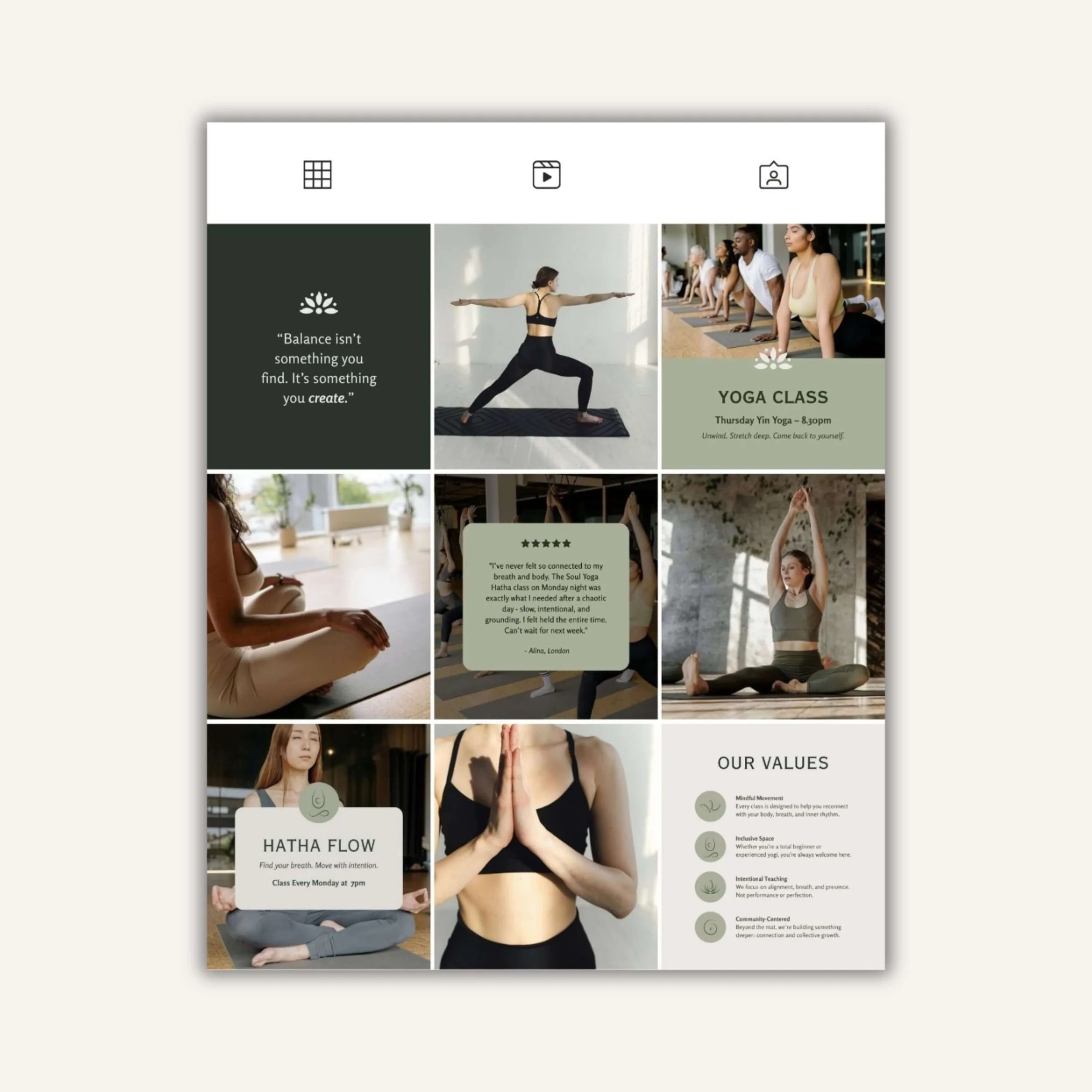
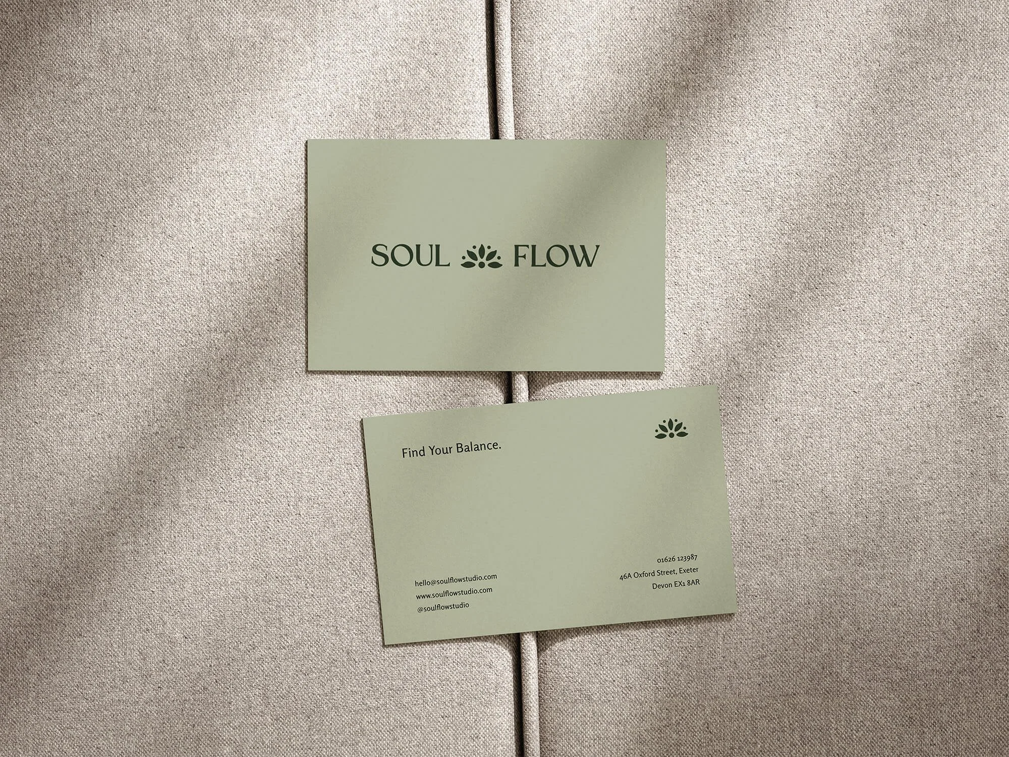
📄 Branded client-facing materials
Professional brands feel consistent everywhere, not just on their website.
That could mean:
Branded client onboarding documents
Welcome guides, proposals, or PDFs that match your visual identity
Simple layouts that feel calm and easy to read
When everything looks like it belongs together, clients subconsciously trust you more.
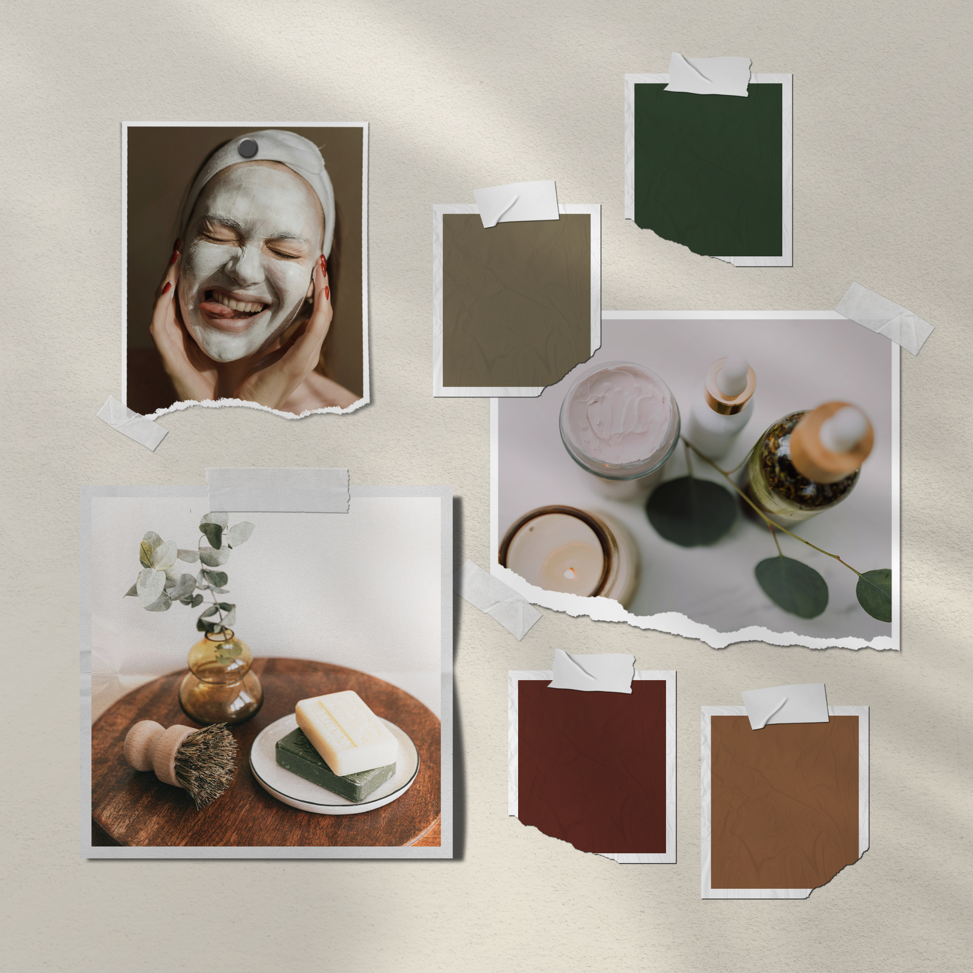
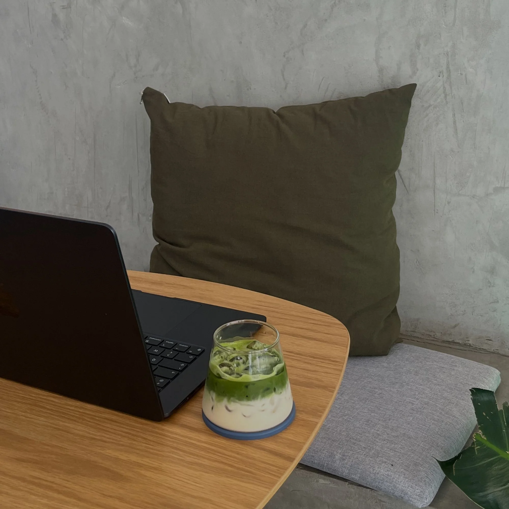
🖼️ High-quality, intentional imagery
Images play a huge role in how professional a brand feels.
This could mean:
Hiring a photographer
Or using carefully curated stock images that suit your brand’s mood and tone
What matters most is consistency. Similar lighting, similar color tones, and a cohesive overall feel will always look more polished than a random mix of images.
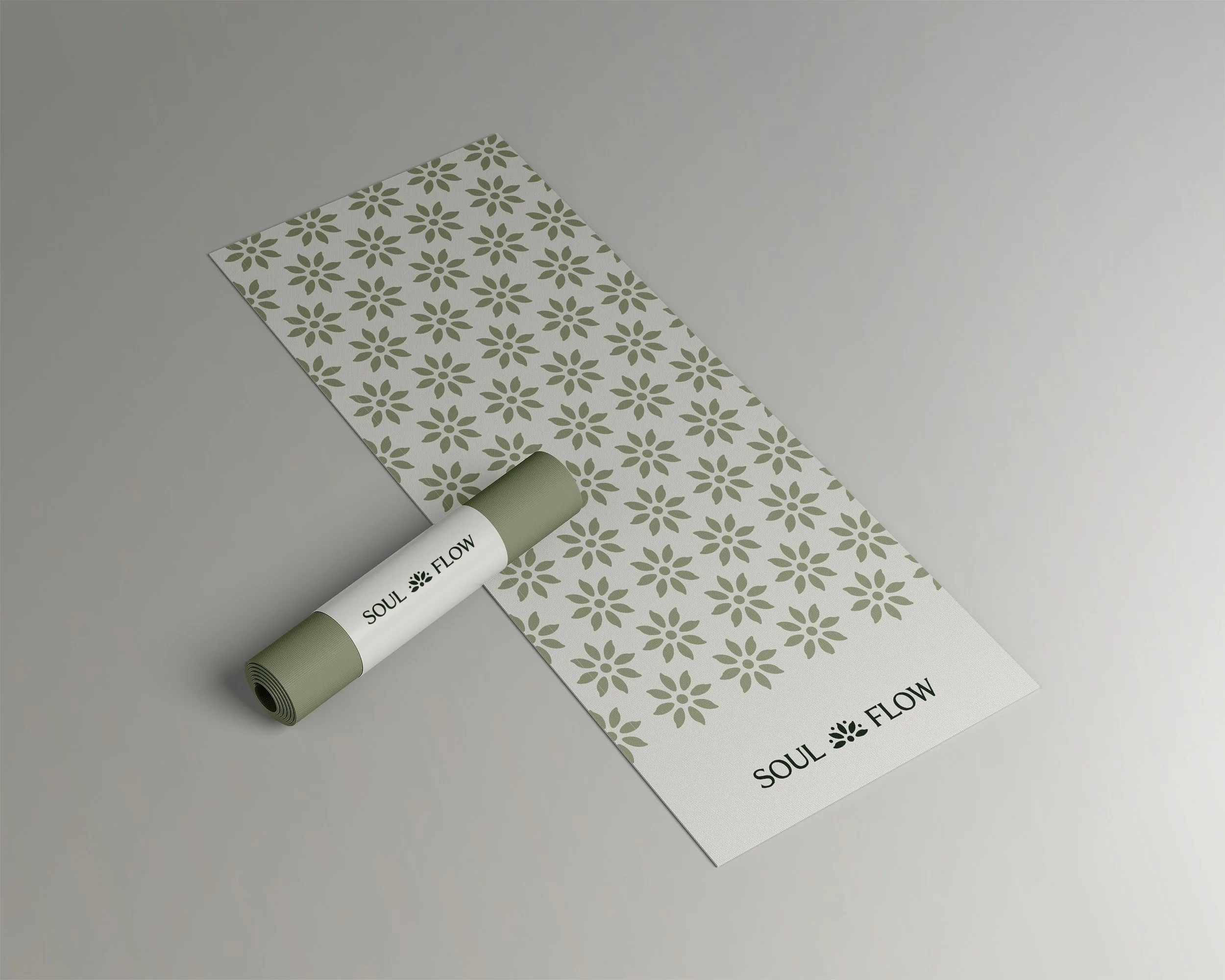
✅ Logos saved correctly (and never pixelated)
Even the best logo can look unprofessional if it’s blurry or stretched.
Professional brands:
Use high-resolution logo files
Save logos in the correct formats for web and print
Avoid pixelation at all costs
This usually comes down to having the right logo variations and knowing when to use each one. If you’re not sure what files you should actually have (or why your logo keeps looking fuzzy), I break it down in more detail in this post: 👉 3 Logo Variations Every Brand Needs
⌨️ Clear, readable typography
Professional branding is easy to read.
That means:
Choosing legible fonts
Using appropriate spacing and hierarchy
Making sure there’s enough contrast between text and background
If people have to squint or struggle to read, the brand instantly feels less polished.
🧘♀️ Intentional, not overdesigned
Professional brands don’t try to do everything at once. They keep layouts simple, leave space to breathe, and repeat the same design choices consistently. Restraint is often what separates a professional brand from a DIY one.
A professional brand isn’t about having more. It’s about making intentional choices and applying them consistently.
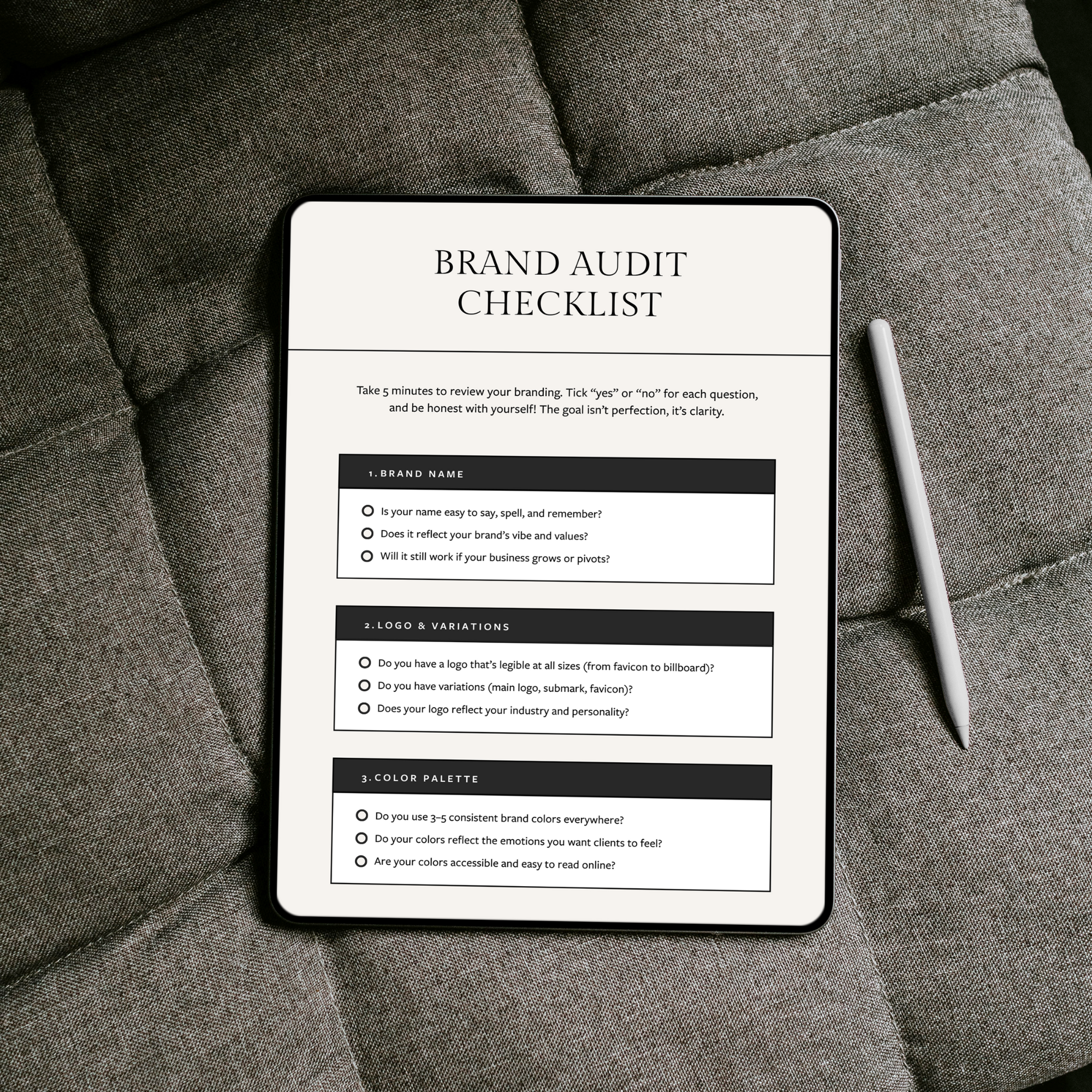
💡 Tip: Save this checklist or pin it on Pinterest so you can come back to it whenever you’re reviewing your branding.
Create a Brand That Feels Put Together
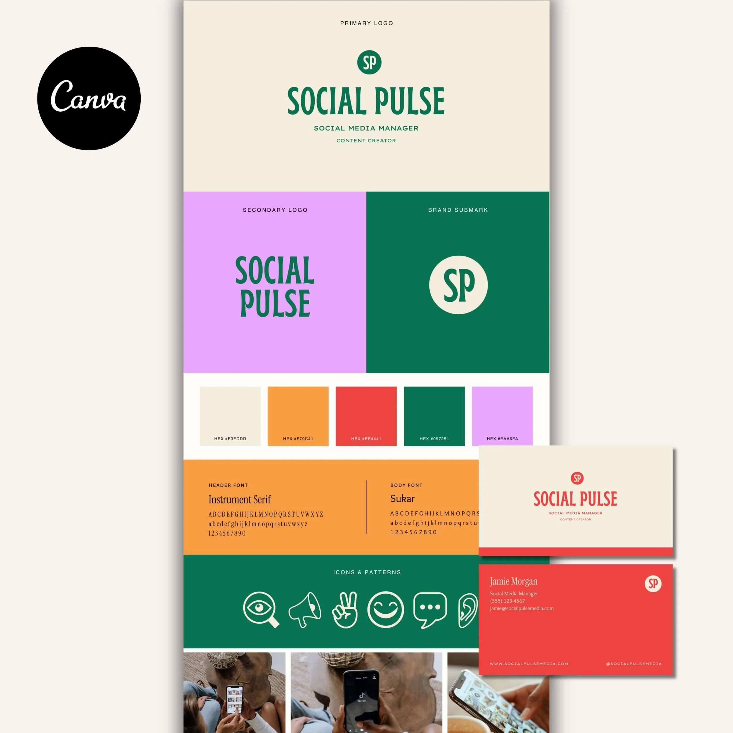
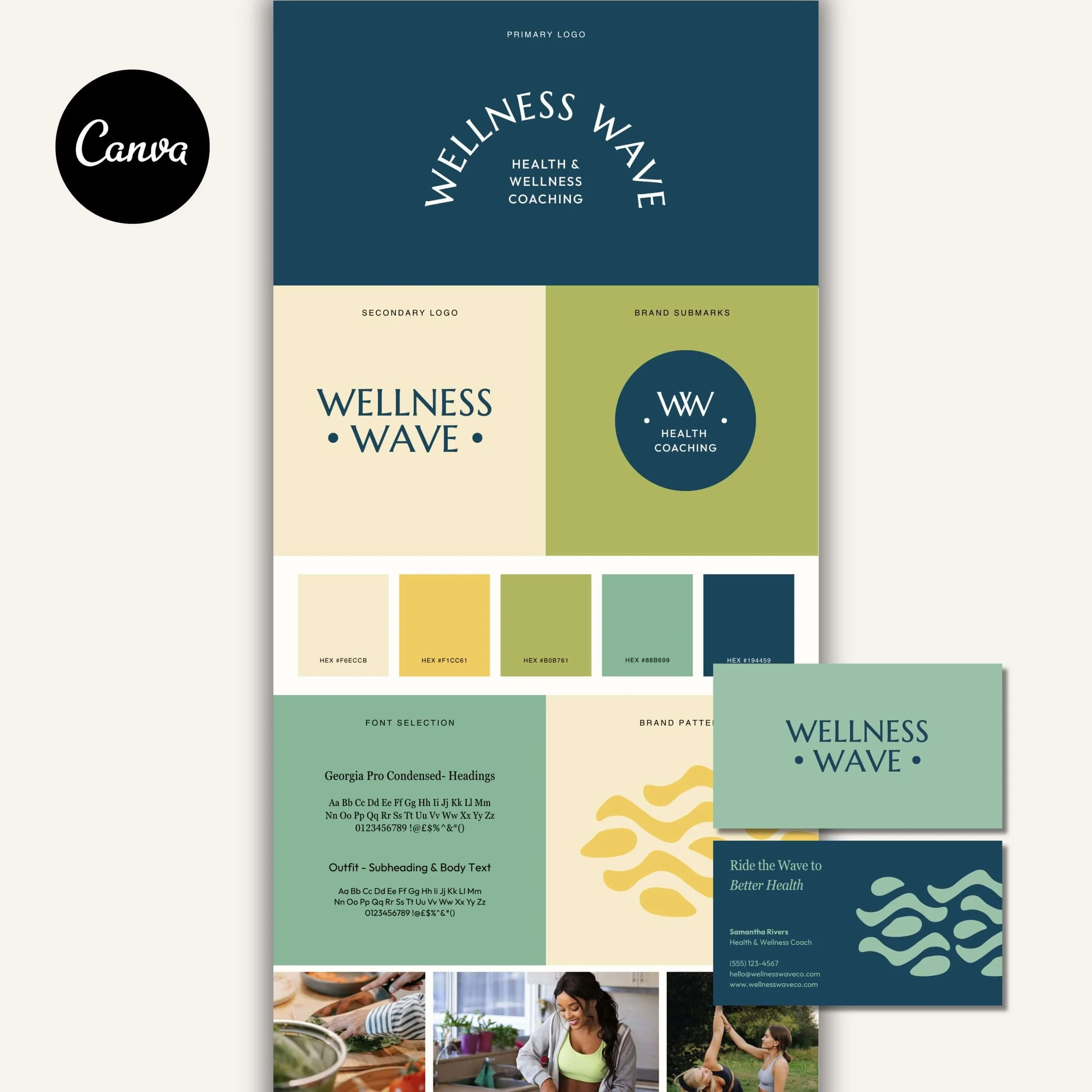
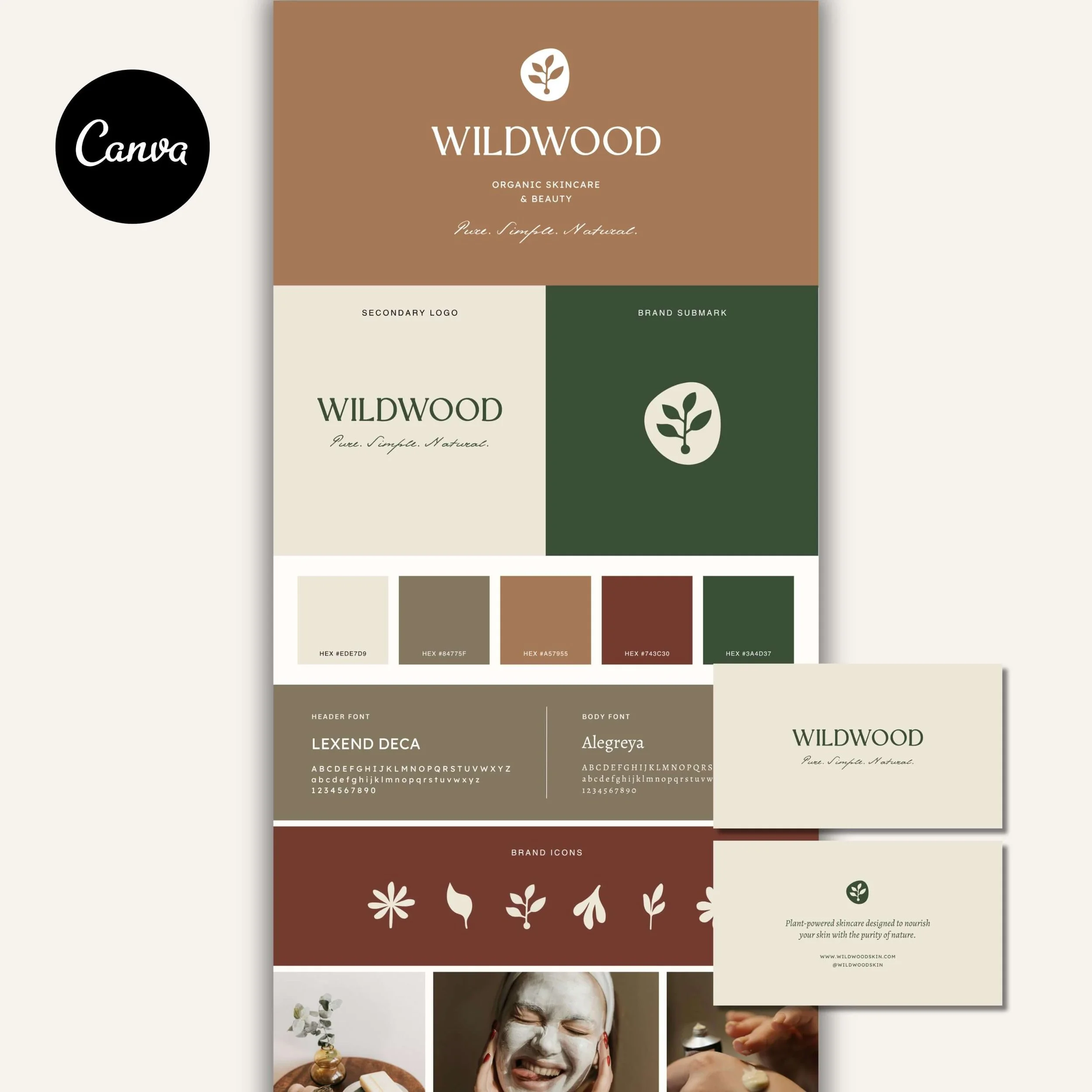
If your current branding feels pieced together from mismatched templates, it can be hard to feel confident showing up, even when you know your work is genuinely good! My premium Canva brand kits give you a complete, cohesive brand identity, including logos, colors, fonts, and templates that are designed to work together. Each kit is professionally designed for you, then made easy to customize yourself, so you can achieve a polished, professional look without the cost of custom branding.

Meet the Designer
Hey, I’m Joanna, a UK-based brand identity designer and founder of JK Creative Co. After 5+ years designing for startups, creatives, and purpose-led businesses, I’ve shifted my focus to making beautiful, strategic branding more accessible. Through my collection of premium brand kits, I help small business owners and entrepreneurs launch with confidence - no custom process or big agency budget required.
💡 Want to see how I can support your brand? Explore the kits →