3 Common Branding Mistakes Small Business Owners Make
Strong branding isn’t just pretty, it serves an important purpose. Many business owners start with colours, fonts, or a logo, but skip the foundation. The result is usually brand that looks nice to begin with, but feels disjointed and confusing over time.
If you want your business to feel clear, confident, and cohesive, there are a few common branding mistakes worth avoiding. In this post, I’m breaking down the three mistakes I see small business owners make most often, and more importantly, how you can fix them! 👇
Mistake 1: Skipping Brand Strategy and Audience Clarity
When you start a business, it’s easy to jump straight into the aesthetics, choosing colors, fonts, and logos. And don’t get me wrong, that’s my favorite part too! But before you get there, it’s important to define your brand values, mission, and audience. These form the foundation of a strong brand identity.

Why it matters
If you don’t know what your brand stands for, it’s easy to create something that feels disconnected or generic over time. Branding isn’t just decoration, it’s communication. When your audience isn’t clearly defined, your visuals can end up feeling like noise rather than meaning. Nice to look at, but not memorable or purposeful.
✅ How to fix it
If you want help getting clear on who you’re actually building for, my post How to Define Your Ideal Client So Your Brand Actually Connects breaks this down into simple, actionable steps.
Also consider the following:
Why did I start this business?
Who am I here to help, and what transformation do I offer?
What values or beliefs guide the way I work?
Use the answers to guide every decision you make, from your tone of voice to your visual identity. When your messaging, visuals, and values are aligned, your brand naturally feels clearer, more confident, and more cohesive.
Mistake 2: Relying on an Amateur-Looking Logo
Your logo is one of the first things people will notice about your brand. It’s the visual face of your business, and a poor logo design can leave a lasting negative impression. The problem is, many small business owners end up using logos that feel rushed, overly complicated, or clearly DIY. Think tiny details, hard-to-read text, or designs that don’t scale well across different platforms.
Why it matters
An amateur-looking logo can quietly undermine trust, even if the rest of your business is solid. When a logo feels unpolished or inconsistent, it can make your brand appear less established or harder to take seriously, especially at first glance. Your logo sets the tone for your entire visual identity. If it feels off, everything built around it often feels off too.
✅ How to fix it
Focus on simplicity and versatility rather than clever details. A strong logo should:
Be easy to read at any size
Work across different backgrounds and platforms
Feel aligned with your brand’s personality and values
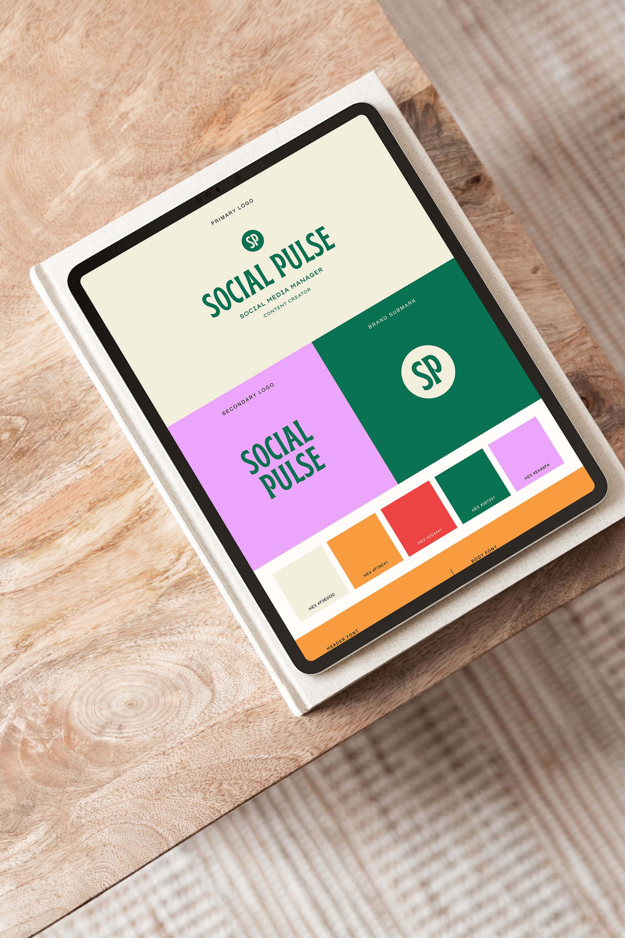
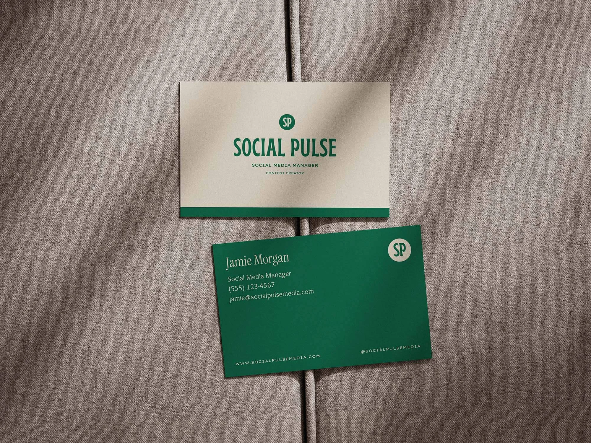
It’s also important to remember that most brands don’t rely on just one logo. Having a small set of logo variations helps your branding stay consistent and professional everywhere it shows up.
If you want to dive deeper into this, I’ve shared more detail on the different logo variations every brand needs and how they’re used across a cohesive brand identity. 👉 Read the post here: 3 Logo Variations Your Brand Needs
Mistake 3: Inconsistent Branding Across Platforms
Once your strategy and logo are in place, consistency is what brings your brand to life. One of the most common mistakes I see is businesses using different colors, fonts, logos, or image styles across their website, social media, emails, and marketing materials. Individually, these elements might look fine, but together they can make a brand feel disjointed or unfinished.
Why it matters
Consistency is what builds recognition and trust. When your branding looks different from one platform to the next, it becomes harder for people to instantly recognize you. Over time, this can weaken your brand’s impact and make it feel less established or professional. Strong branding works through repetition. The more consistently someone sees your visuals, the more familiar and trustworthy your brand begins to feel.
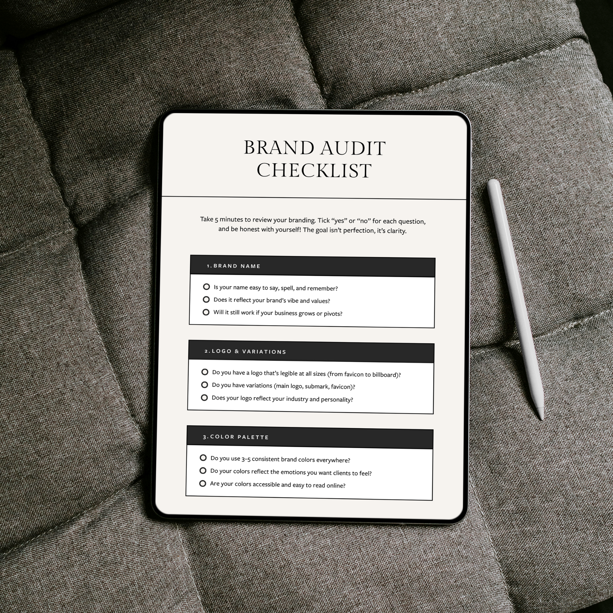
(If you’re not sure how consistent your branding actually is, this post on how to audit your brand walks you through a simple way to spot gaps and tighten things up across every platform.)
✅ How to fix it
Start by committing to a small, defined set of brand elements and using them everywhere. This includes:
The same color palette and fonts across all platforms
Consistent logo usage and sizing
A clear visual style for imagery and graphics
For example, if your website uses soft, light imagery, try to carry that same feeling through to your social media and marketing materials rather than switching styles constantly.
It can also help to create a simple brand guide for yourself. It doesn’t have to be anything fancy, just a reference that outlines your colors, fonts, logos, and tone of voice. This makes it much easier to stay consistent as your business grows.
Not sure what your brand actually needs right now?

Meet the Designer
Hey, I’m Joanna, a UK-based brand identity designer and founder of JK Creative Co. After 5+ years designing for startups, creatives, and purpose-led businesses, I’ve shifted my focus to making beautiful, strategic branding more accessible. Through my collection of premium brand kits, I help small business owners and entrepreneurs launch with confidence - no custom process or big agency budget required.
💡 Want to see how I can support your brand? Explore the kits →