Brand Identity Essentials: How to Build a Brand That Feels Cohesive
Branding can feel overwhelming at first, especially when you’re not sure where to start or what actually matters. The good news is that building a cohesive brand doesn’t have to be complicated. In this post, we’ll break down the essential elements of a brand identity and what to focus on first, so you can create a brand that feels aligned, professional, and true to your business ✨
What is a Brand Identity?
Before we dive into how to create your own brand identity, let’s make sure we’re on the same page about what a brand identity actually is.
A brand identity is everything that makes your business you. It includes the visual elements, brand messaging, and overall vibe that come together to represent your brand. When done right, a strong brand identity helps you connect with your audience and make your business stand out.
Here’s what’s typically included in a brand identity:
Logo: The visual representation of your brand.
Color Palette: The set of colors you choose to represent your brand’s personality.
Typography: The fonts that convey the feel of your brand.
Brand Voice: How your brand communicates, whether you’re fun, professional, or quirky.
Brand Values: The beliefs and principles that your business stands for.
A well-defined and consistent brand identity builds trust with your audience and helps you make a memorable impression.
The Foundations of a Cohesive Brand Identity
Now, let’s get into the nitty-gritty of how to build your brand identity step by step 👇
Step 1: Define Your Brand Values and Mission
Before you choose colors and fonts, it’s essential to know what your brand stands for. This step shapes everything from your messaging to your visual identity.
What is your business about? Why did you start it?
What transformation do you help your clients achieve?
How do you want your brand to feel?
Who is your ideal client?
What do they care about, and what brands are they drawn to?
Step 2: Choose Your Brand Name
Choosing the right name for your brand is one of the most important decisions you'll make. Your brand name sets the tone for how your audience perceives your business and plays a key role in shaping your overall identity.
What does your brand stand for? Your name should reflect the core values and mission of your business.
Keep it memorable: A great brand name is easy to remember, spell, and pronounce. You want it to stick with your audience.
Check for availability: Ensure your brand name is available as a domain and on social media platforms to keep your branding consistent.
Action Step: If you’re still deciding on your brand name, check out my Brand Naming Guide. It will help you brainstorm and choose a name that resonates with your audience and aligns with your brand’s mission.
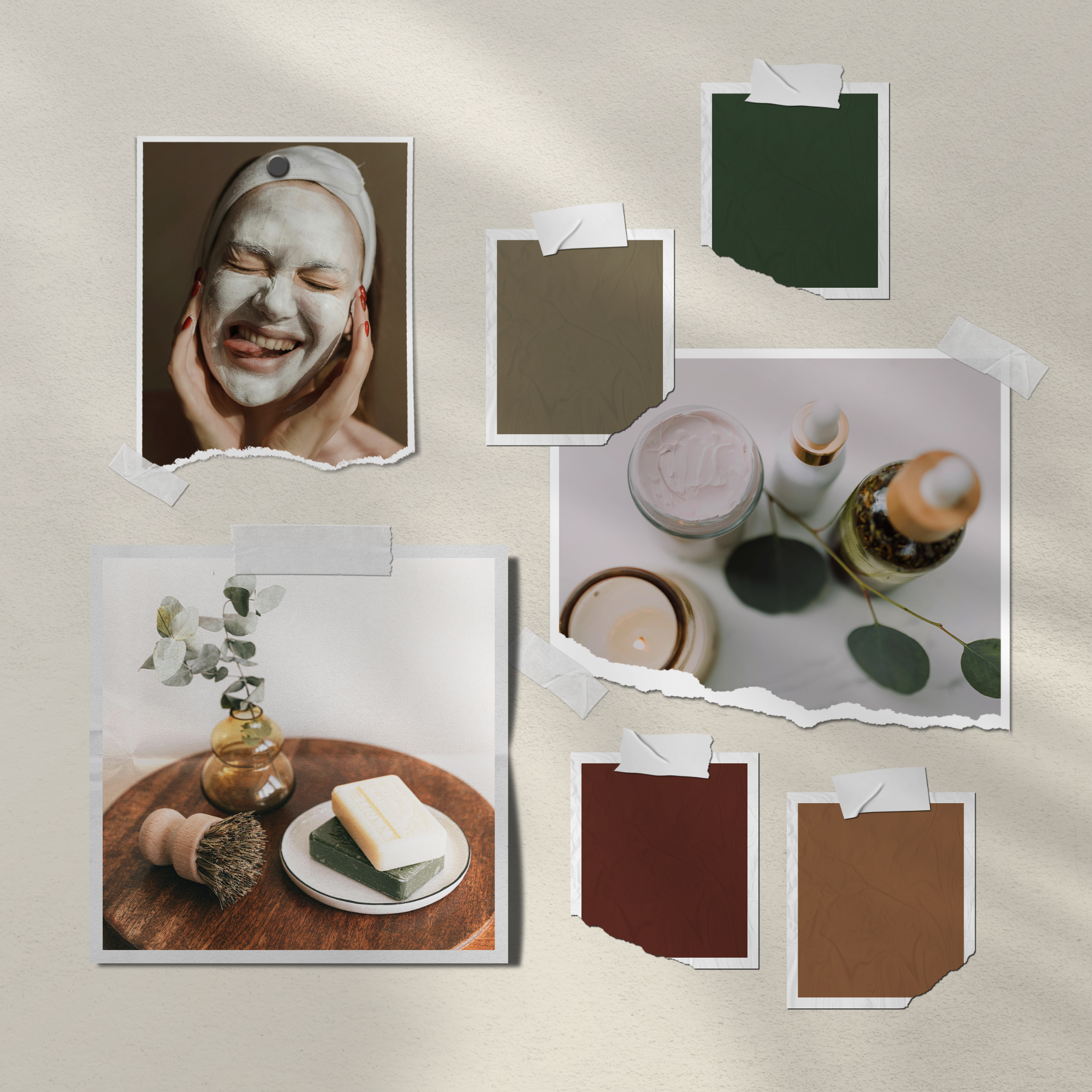
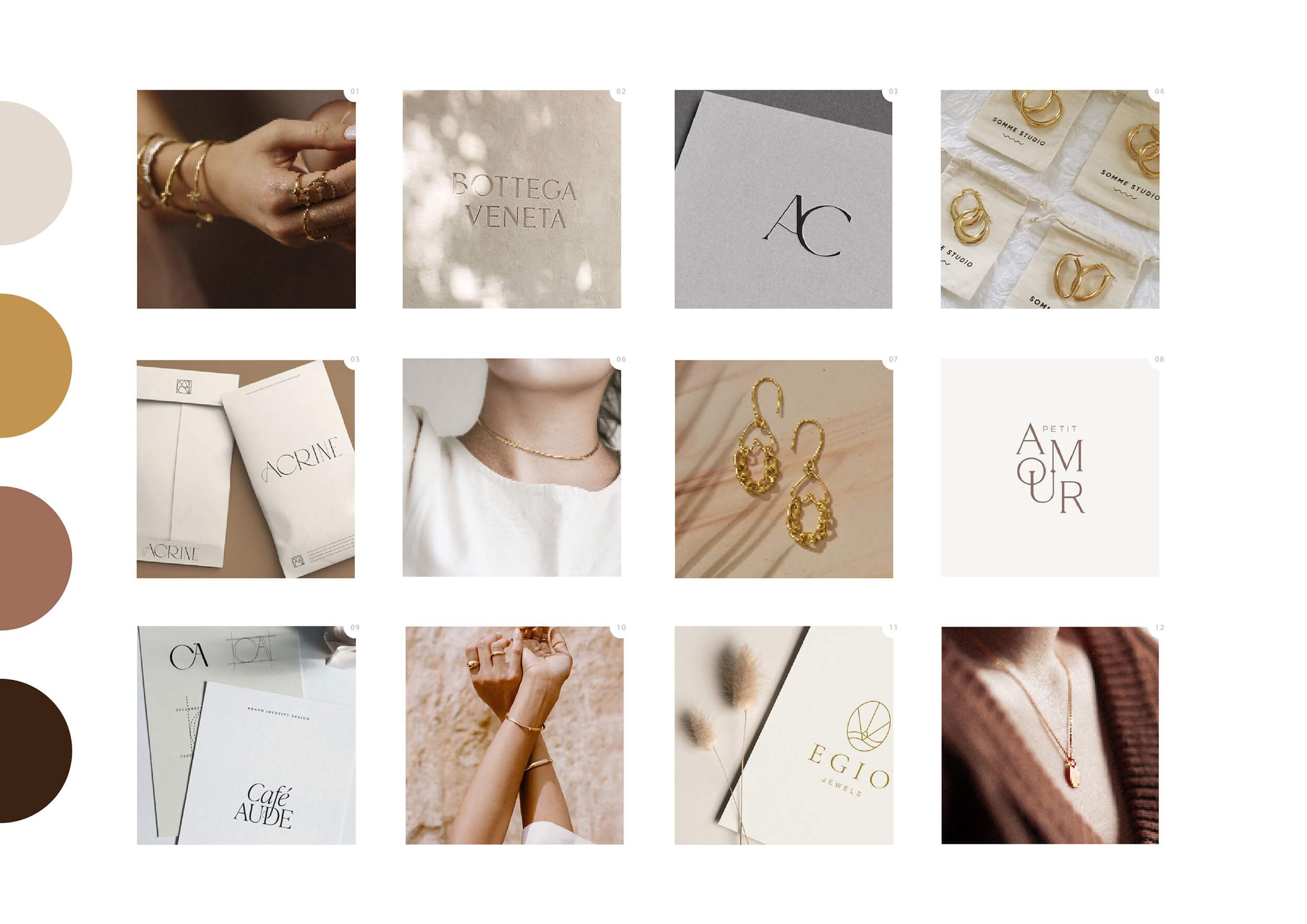
Step 3: Do Your Research & Create a Moodboard
Now that you understand your brand values, it’s time to start thinking visually. A moodboard helps translate those ideas into a clear look and feel, not just a collection of things you like.
Instead of pinning everything that catches your eye, focus on gathering visuals that reflect the specific direction you want your brand to move in. This might include imagery, color palettes, typography styles, textures, and references from brands with a similar tone or audience.
If you’re finding yourself drawn to lots of different styles, that’s usually a sign the overall aesthetic isn’t clear yet. I go deeper into this in How to Choose a Brand Aesthetic That Attracts the Right Clients, which helps you narrow your options before committing visually.
Action step:
Create a moodboard in Pinterest or Canva and aim for cohesion over variety. Choose visuals that feel consistent in mood, energy, and tone. This board should act as a visual filter for future design decisions, not a dumping ground for inspiration.
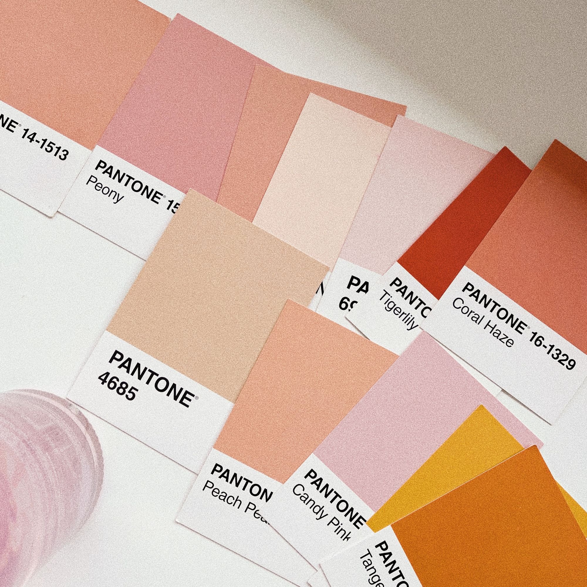
Step 4: Choose Your Brand’s Color Palette
Color plays a huge role in how your brand is perceived. The right palette helps communicate your brand’s personality and values at a glance, before anyone reads a word.
A strong, versatile color palette usually includes:
Core colors. Choose two to three main colors that reflect your brand’s personality. These will be used most often across your branding, from your logo to headings and highlights.
A neutral color. Add a light neutral, such as off-white, cream, or soft grey, to use as a background. This creates breathing space and helps your other colors stand out.
A dark accent color. Include one darker shade for text and contrast. This helps with readability and gives your brand depth and structure.
When choosing your colors, focus on alignment rather than trends. Ask yourself what you want your brand to feel like, and choose colors that reflect your brand’s values and the emotions you want to evoke. A bold, energetic brand will lean into brighter, high-contrast colors, while a calming or nature-led brand may feel more aligned with softer, earthy tones.
If you’re looking for inspiration, explore the Bold Colour Palettes blog post or the Feminine Brand Color Palettes post, where I share curated combinations to help you find colors that feel right for your brand.
Step 5: Select the Right Typography
Typography plays a bigger role in branding than many people realise. The fonts you choose help communicate your brand’s personality and set the tone for how your business is perceived, whether that’s modern, refined, playful, or professional.
When choosing fonts, focus on how they work together across your brand. The goal is to create a clear visual hierarchy that feels cohesive and easy to read.

Most brands need a small, considered set of fonts:
Primary logo font. This is the font used for your logo and brand name. It should feel distinctive and aligned with your brand personality. To keep it impactful, avoid using this font elsewhere in your branding.
Supporting font. If your logo includes a tagline or secondary text, choose a complementary font that supports the main logo without competing with it. This font can often be reused across your website and marketing materials.
Heading font. Your heading font should be strong and attention-grabbing, while still working in harmony with your logo. It helps guide the eye and create structure across your content.
Body text font. For longer text, choose a font that’s easy to read and comfortable on screens. Simple serif or sans-serif fonts tend to work best here.
Call-to-action font. Buttons and calls to action should be clear and legible. A bold, simple font helps make actions easy to spot and understand.
Using a small number of fonts consistently will create a clear hierarchy and make your brand feel more polished and professional.
If you’re unsure where to start, Canva’s Ultimate Guide to Font Pairing is a helpful resource for choosing font combinations that work well together.
Step 6: Create a Logo (And Different Variations)
Your logo is one of the most recognisable parts of your brand. It’s often the first thing people notice, and it plays a big role in how professional and established your business feels.
What many people don’t realise is that a logo isn’t one single design. To keep your branding consistent and adaptable, you’ll need a small set of logo variations that work across different spaces and formats.
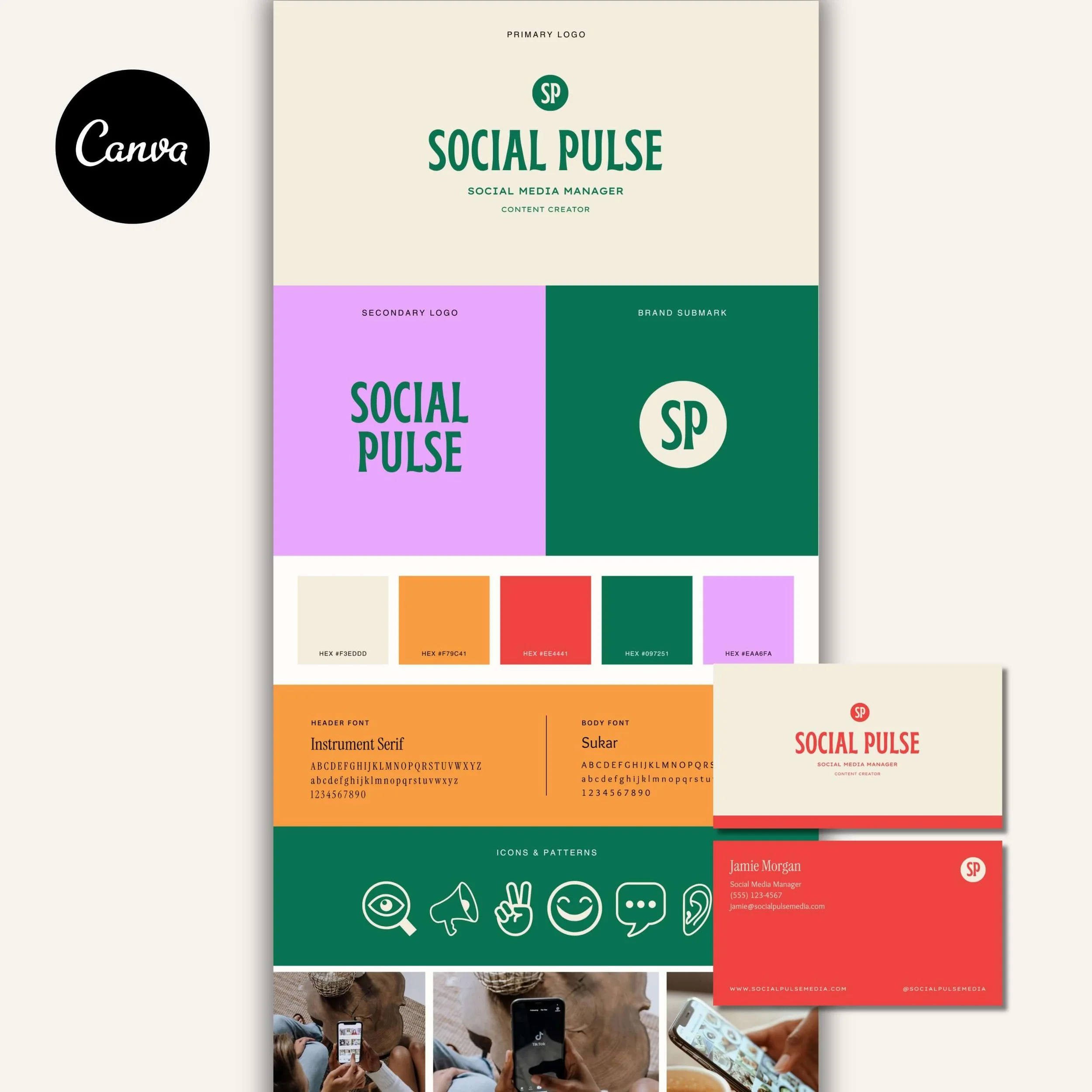
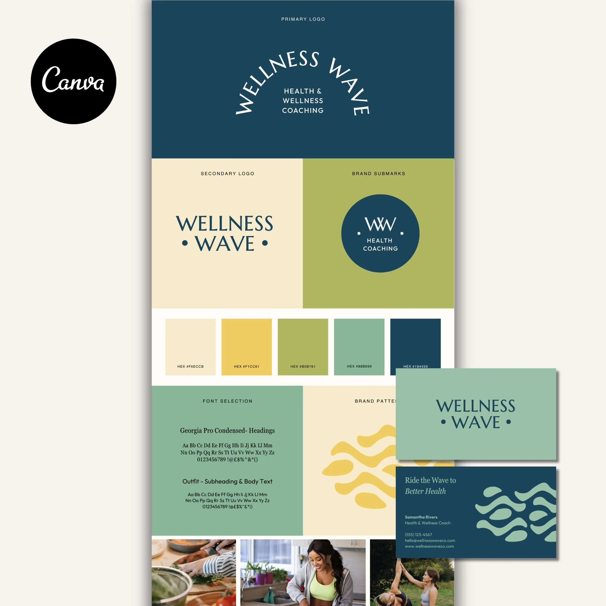
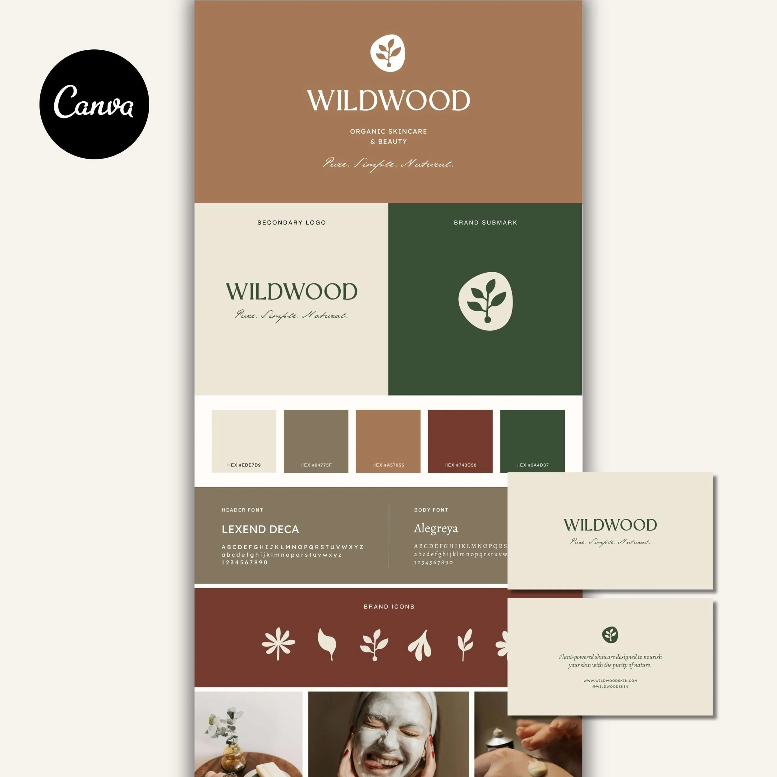
Most brands benefit from three core logo variations:
Primary Logo: This is your main logo and the version you’ll use most often. It usually includes your brand name and key design elements, and works best on your website and larger marketing materials.
Secondary Logo: A simplified or more compact version of your primary logo. This is useful when space is limited, such as on social media, email signatures, or smaller layouts.
Submark: The most minimal version of your logo, often an icon or symbol. Submarks work well in small, square spaces like social media avatars or favicons, and help keep your brand recognisable at a glance.
Having these variations allows your brand to stay consistent and professional everywhere it shows up, without forcing one logo to fit every situation. If you want a deeper breakdown of how these logo variations work in practice, take a look at the 3 Logo Variations Every Brand Needs blog post.
Step 7: Bring All Your Elements Together with a Brand Board
Once you’ve chosen your colors, fonts, logos, and other visual elements, the final step is bringing everything together in one place with a brand board.
A brand board is a simple, one-page reference that shows how all your brand elements work together. It helps you see your brand as a whole, rather than a collection of separate decisions.

A typical brand board includes:
Your logo and logo variations
Your color palette, including hex codes
Your chosen fonts and how they’re used
Optional extras such as icons, patterns, or supporting graphics
This is also a great point to consider your brand voice. Alongside your visuals, think about how your brand sounds. What tone do you want to use in your website copy, captions, and emails? Calm and reassuring, bold and confident, or warm and conversational?
Having both your visuals and your voice defined makes it much easier to stay consistent as your business grows. If you want help clarifying this, you might find this post on finding your brand voice and creating messaging that feels aligned helpful.
The purpose of a brand board is to keep everything consistent across your website, social media, and marketing materials, so your brand feels recognisable and intentional wherever it shows up.
Create a Brand That Feels Put Together
If your current branding feels pieced together from mismatched templates, it can be hard to feel confident showing up, even when you know your work is genuinely good! My premium Canva brand kits give you a complete, cohesive brand identity, including logos, colors, fonts, and templates that are designed to work together. Each kit is professionally designed for you, then made easy to customize yourself, so you can achieve a polished, professional look without the cost of custom branding.

Meet the Designer
Hey, I’m Joanna, a UK-based brand identity designer and founder of JK Creative Co. After 5+ years designing for startups, creatives, and purpose-led businesses, I’ve shifted my focus to making beautiful, strategic branding more accessible. Through my collection of premium brand kits, I help small business owners and entrepreneurs launch with confidence - no custom process or big agency budget required.
💡 Want to see how I can support your brand? Explore the kits →